Image shows contents of Scrawlrbox #092 art subscription box. Items included are: Postcard of featured artist’s work (butterfly), a pad of A5 paper, a bottle of masking fluid, a sticker, a tin of Faber-Castell Albrecht Durer watercolour pencils in orange, green, yellow, light blue and grey, a challenge prompt card, a wrapped candy and a white paintbrush.
Faber-Castell is a brand I use regularly in my own practice, so this box was a fun one for me.
The colours included made sense, and the inclusion of a grey pencil was welcome as it meant I could tone down the brighter colours included the tin.
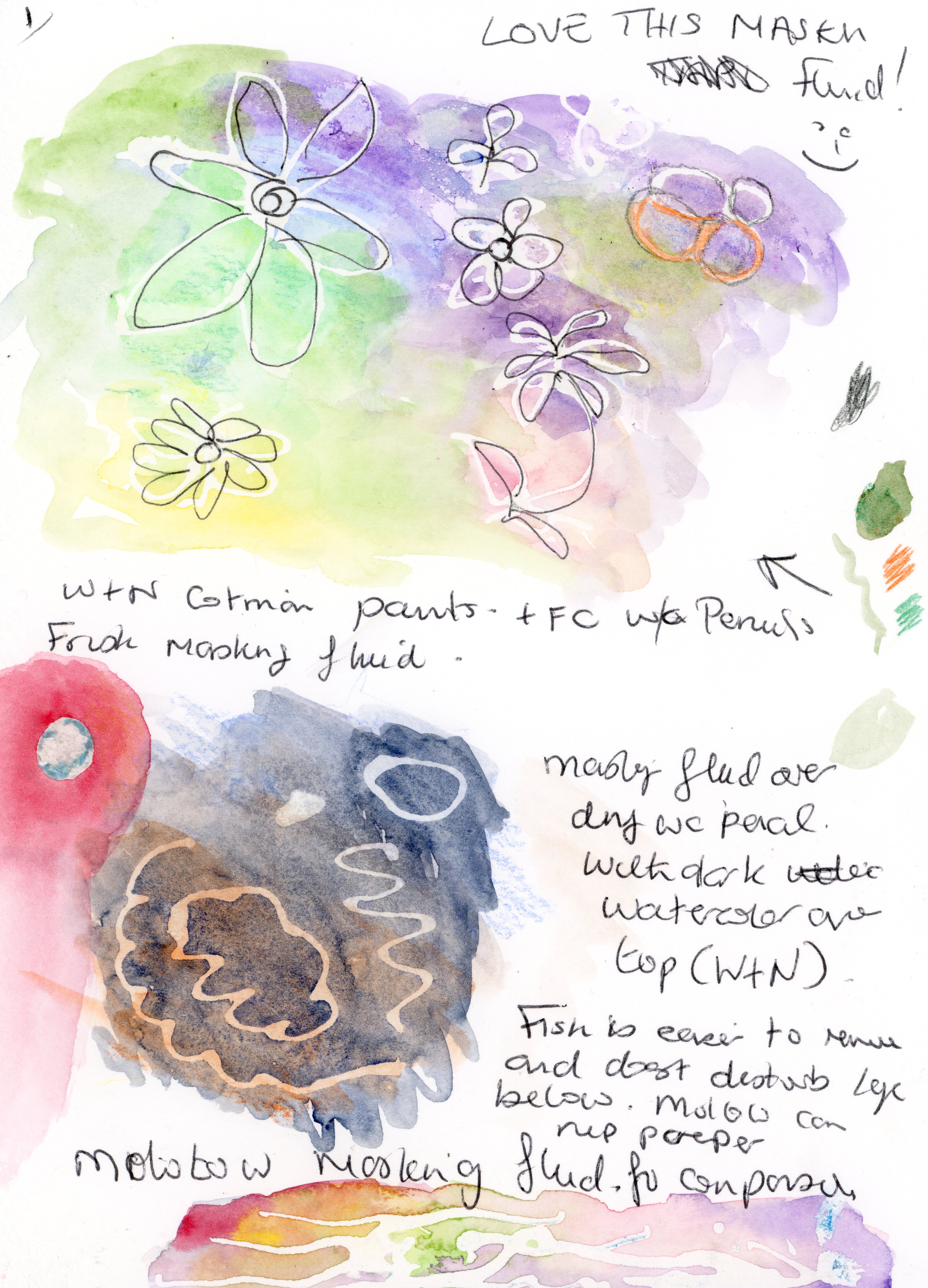
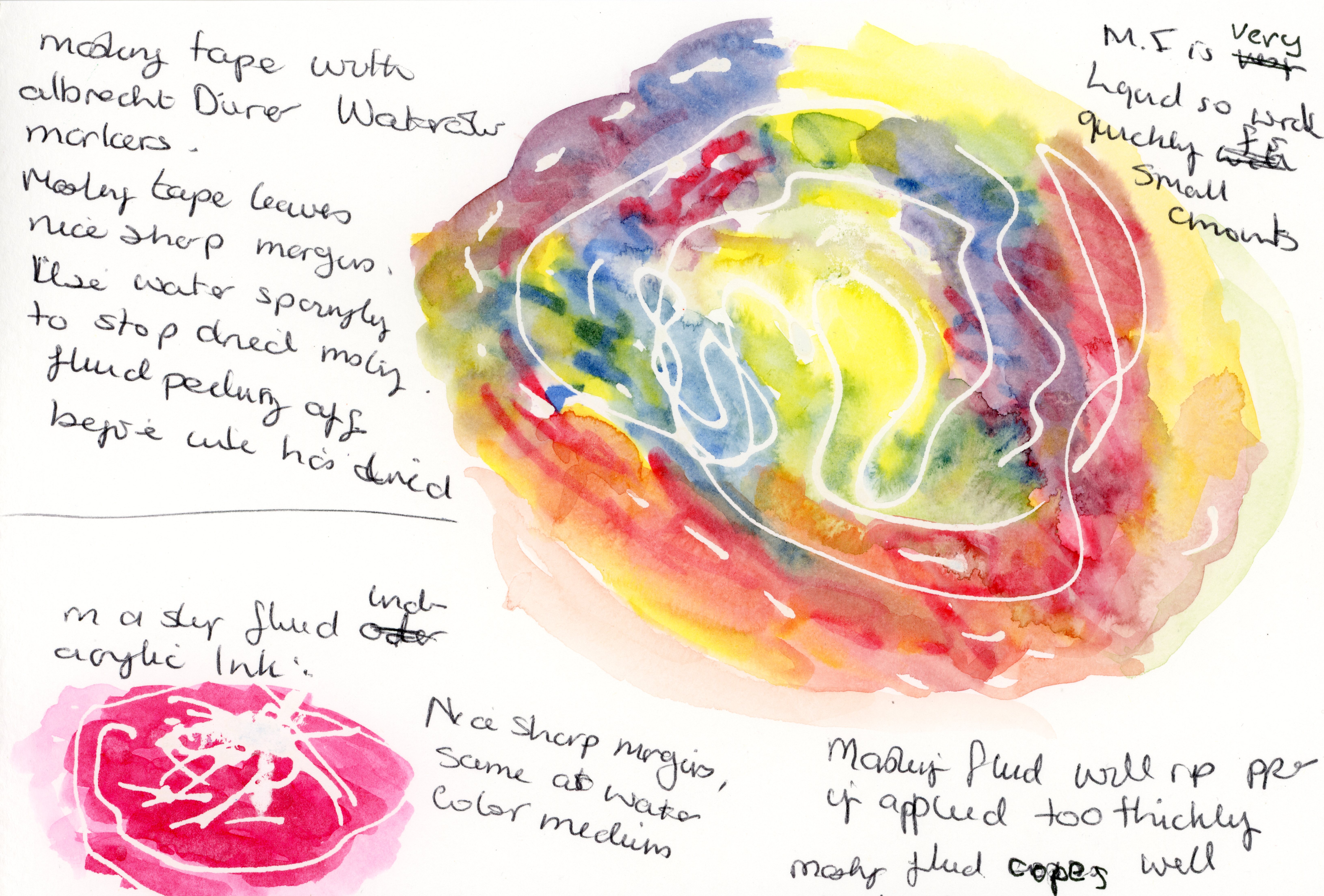
Previous experiences of masking fluid have been quite hit-and-miss for me, so I was interested to try this brand and I was not disappointed. The fine nozzle left crisp lines, and although it takes some practice to learn to control the flow of masking fluid, once you find your own technique, it’s really fun to use, and you can get some interesting effects. One thing to be aware of is that the masking fluid will peel off if you use too much water. It also copes well with a heat gun if you wish to hasten the drying time.
I also tried the masking fluid with acrylic inks and various brands of watercolour, and all worked equally well. One thing I would say is to try and keep layers of masking fluid thin as if it’s applied too thickly, it will tear the paper when you try to remove it, regardless of which brand of paper you use.
Images show results of masking fluid used in conjunction with acrylic inks, watercolour pencils and Winsor and Newton Cotman Watercolour paints.
I really like ProArte brushes, so I give this one 10/10.
I’d give the paper 8/10. It handles wet-in-wet techniques well and colours bleed into each other seamlessly. The only reasons I gave this paper 8/10 is because if you use too much water it pills quite easily once wet, and it does curl with relatively small amount of wet media and doesn’t flatten when dry, but this could be rectified by placing your dry piece between two heavy books.
All in all, I’d recommend this box if you’re already a fan of watercolour pencils or you’d like to try them.
Performance when used in conjuction with masking fluid.
How easy is it to reactivate and lift colour once dry?
How do Polychromos pencils perform over activated watercolour pencil once dry?
Comfort and ease of use.
Are the pencils easy to sharpen? Do they break often?
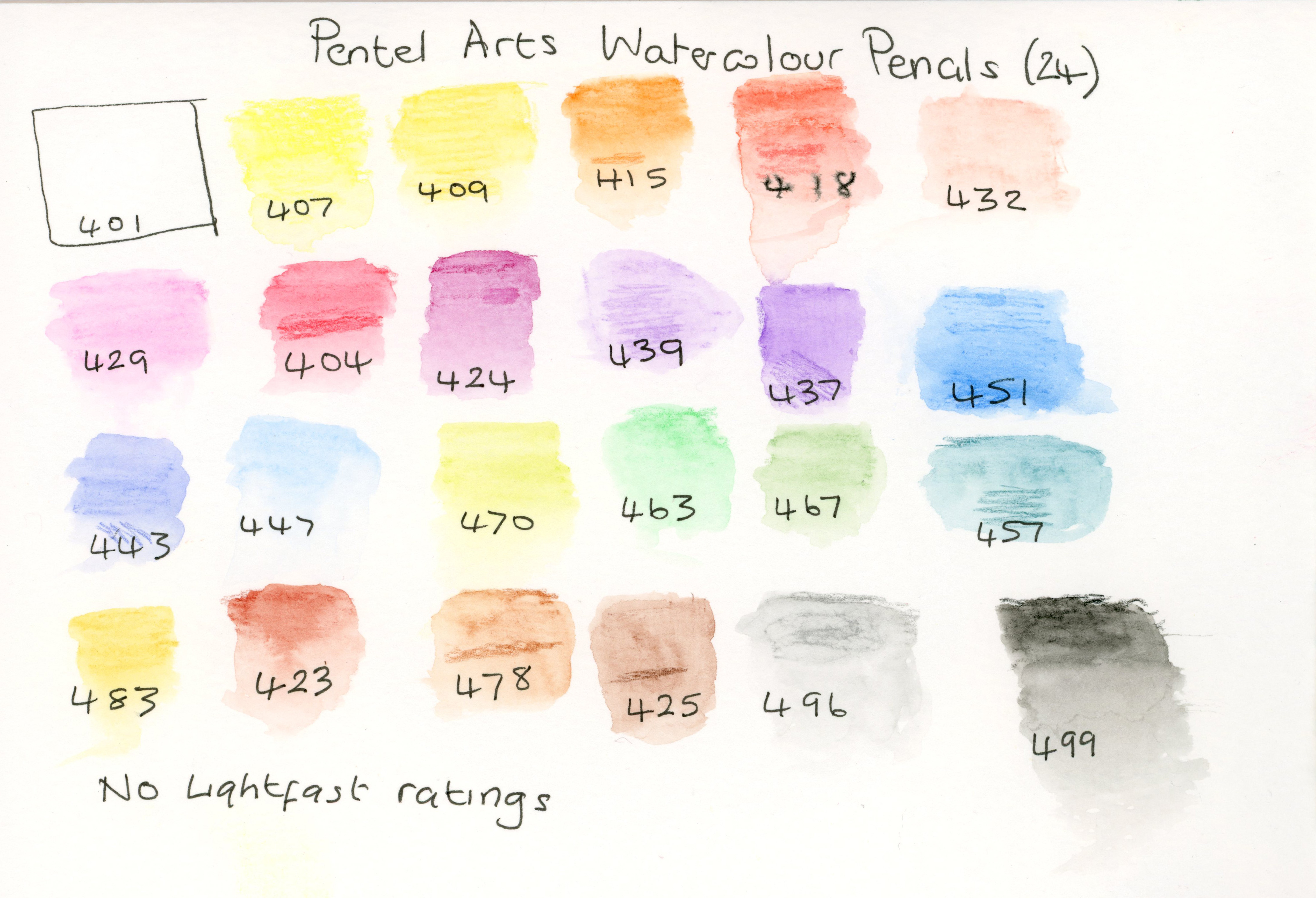
Colour range*.
*NOTE: FOR THE PURPOSES OF THIS REVIEW I WILL ONLY BE TAKING INTO ACCOUNT THE COLOURS OFFERED IN THE ALBRECHT DURER 24 SET AND NOT THE FABER-CASTELL RANGE AS A WHOLE.
1. Colour intensity.
Although the Pentel colours are impressive for the price point, when I compare – for example – the magenta colour in the Pentel range (424) with it’s magenta equivalent (133) in the Albrecht Dűrer set, the difference in the richness and saturation of colour is obvious. I find the addition of a white pencil equally pointless in both sets, as neither are opaque enough when activated to offer any useful applications.
I also found that the Pentel magenta colour required the application of several dry layers in order to come close to matching the coverage and intensity of colour that one layer of Albrecht Dűrer produced when activated.
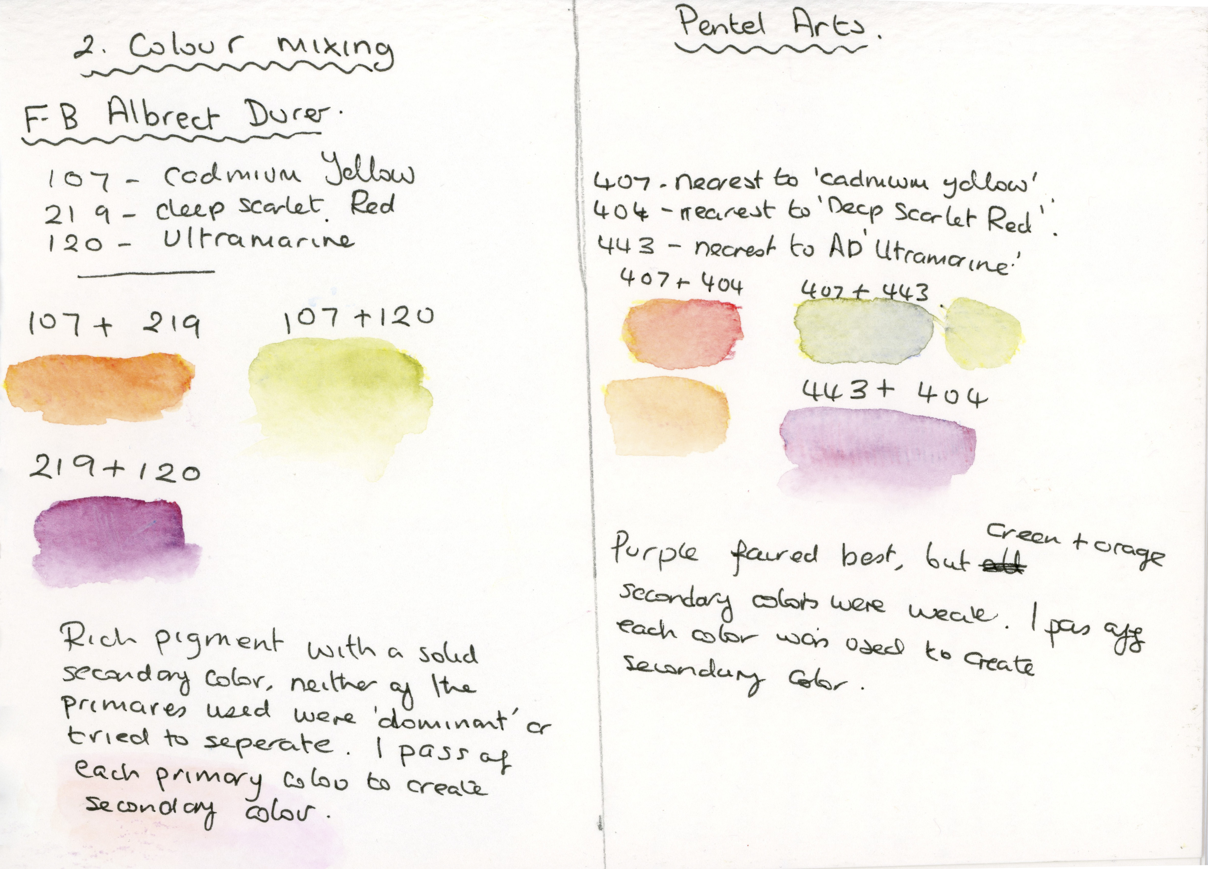
2. Mixing Colours
As you can see from my notes above, Albrecht Dűrer provided a nice vibrant, uniform colour when mixed (one layer of each colour) compared to Pentel, which offered a much more diluted colour, which is not necessarily a bad thing if you want to exploit this quality when you’re looking for delicate colours. What was of more concern to me was the Pentel colours’ propensity to separate, or for one of the primaries to ‘dominate’ the tint of the secondary colour, despite applying just one layer of each colour for both brands.
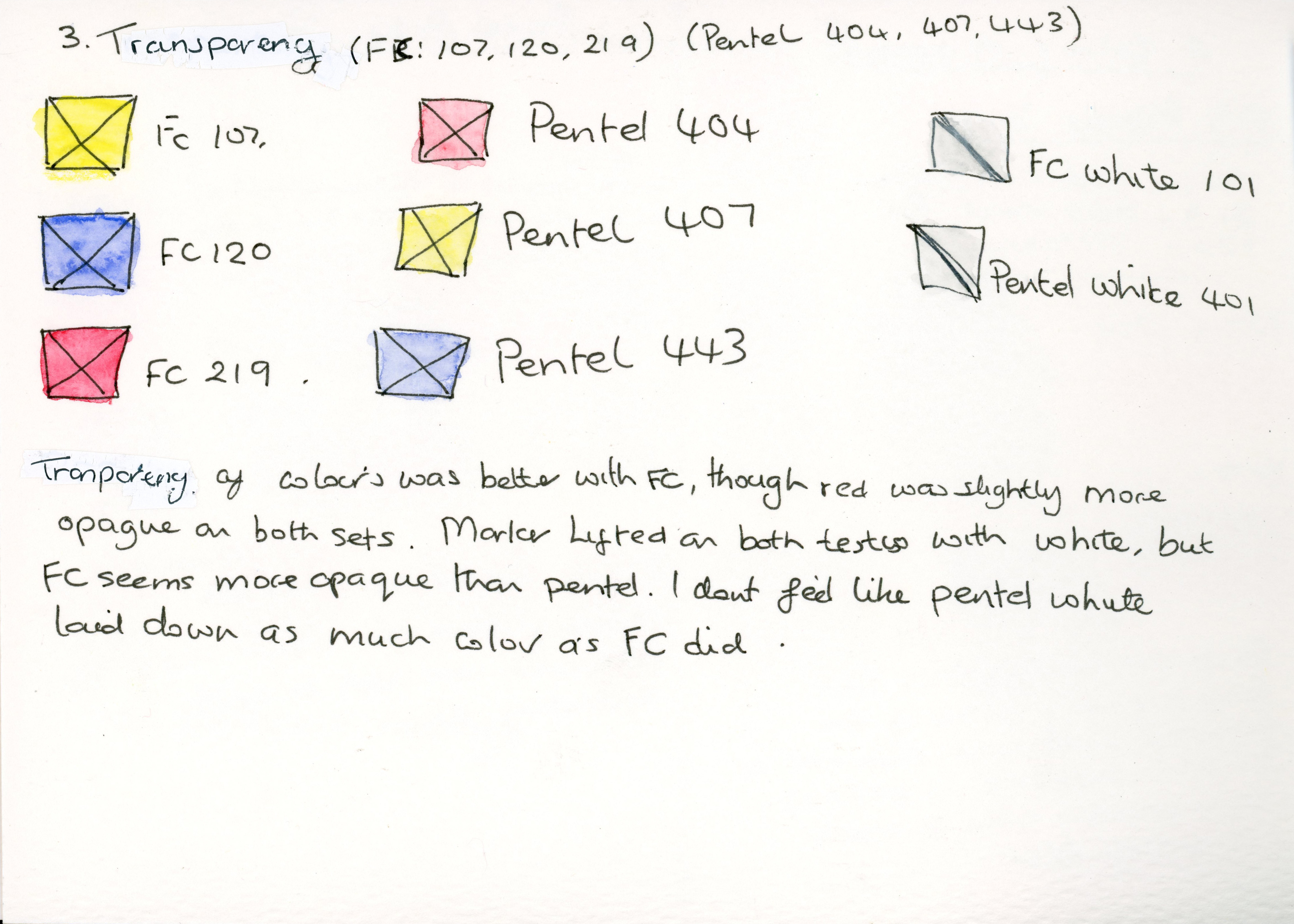
3. Transparency
For this test, each box was created with Steadtler Pigment liners, then left to dry before applying watercolour pencil over the top.
Again, Albrecht Dűrer performed best, although the red in both sets showed the highest opacity (excluding the white in both sets, obviously). Interestingly, when I activated the white in both sets, it lifted the fineliner slightly.
The Albrecht Dűrer white pencil showed slightly more opacity than the Pentel white.
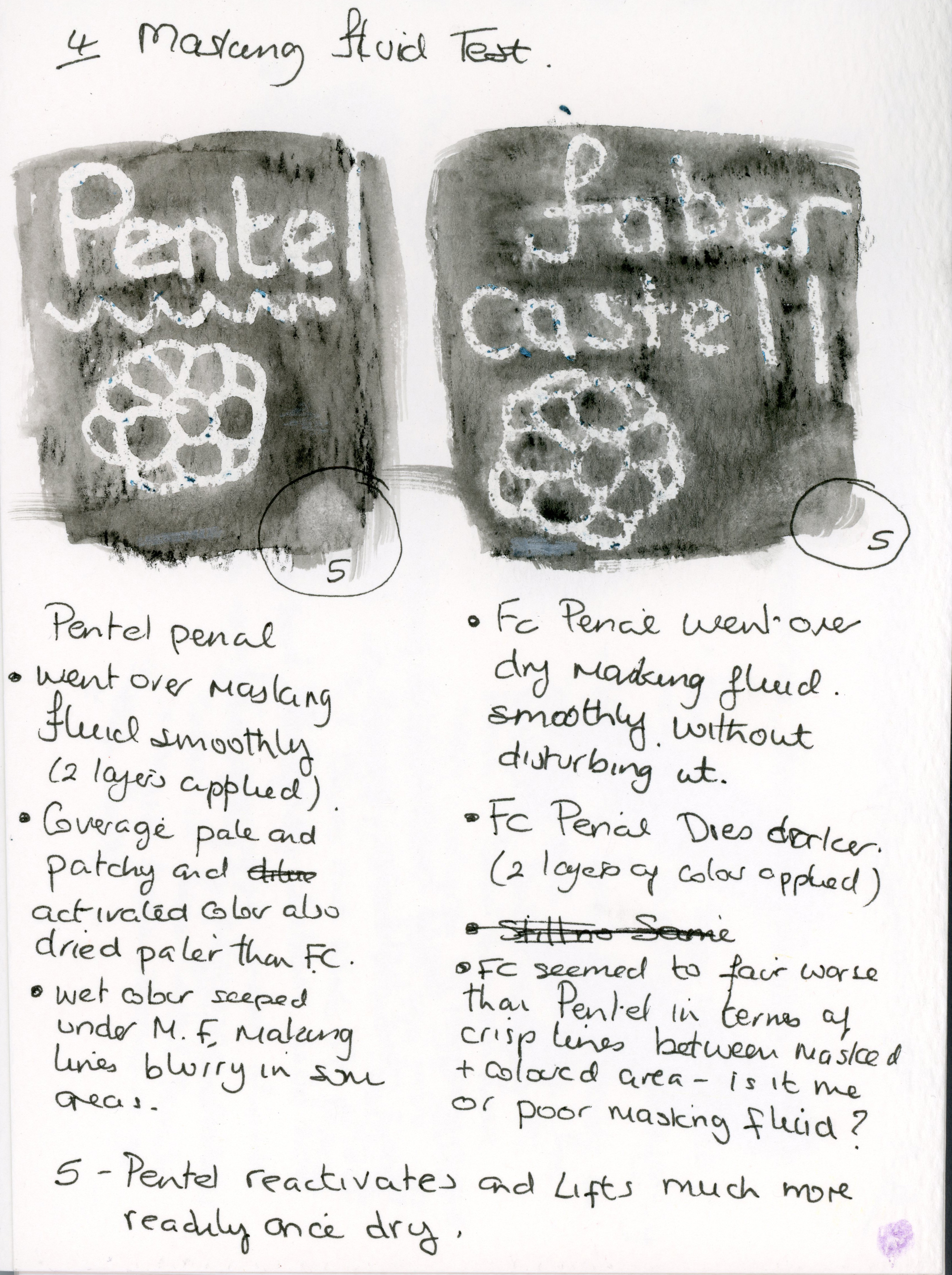
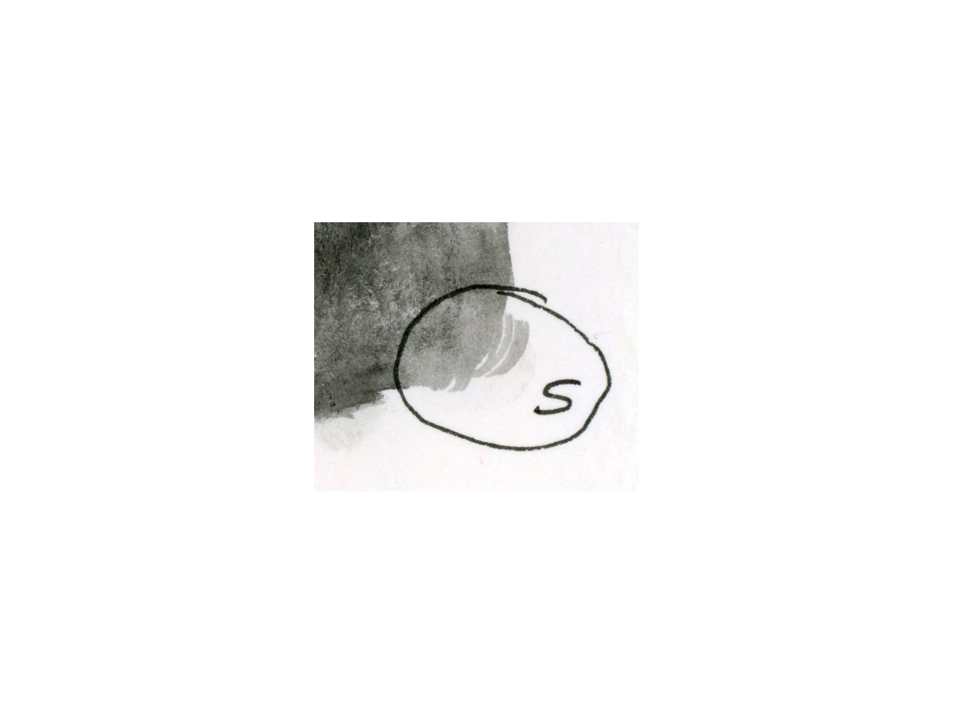
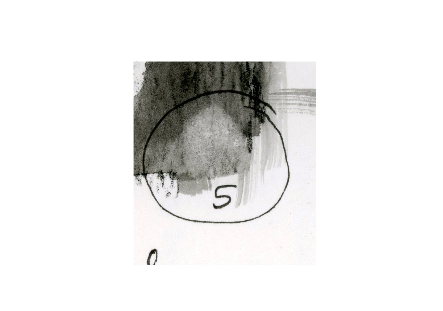
4.Performance when used in conjunction with masking fluid.
For this test, I used the same design in masking fluid, then once dry I applied two layers of watercolour pencil before activating with the watercolour brush, which allowed me to apply the same amount of water to each section.
Both pencils were easy to apply over dried masking fluid, with Albrecht Dűrer providing the most intense and even colour when activated.
The lines between masked and painted areas seemed cleaner with the Pentel pencils, but I am not sure if this is down to user error, as I’ve had this happen when I used this masking fluid in previous product reviews.
5.How easy is it to reactivate and lift colour once dry?
Albrecht Dűrer Pentel
Whilst both pencils reactivated readily, the Pentel pencil lifted more easily, with Albrecht Dűrer showing good staining qualities.
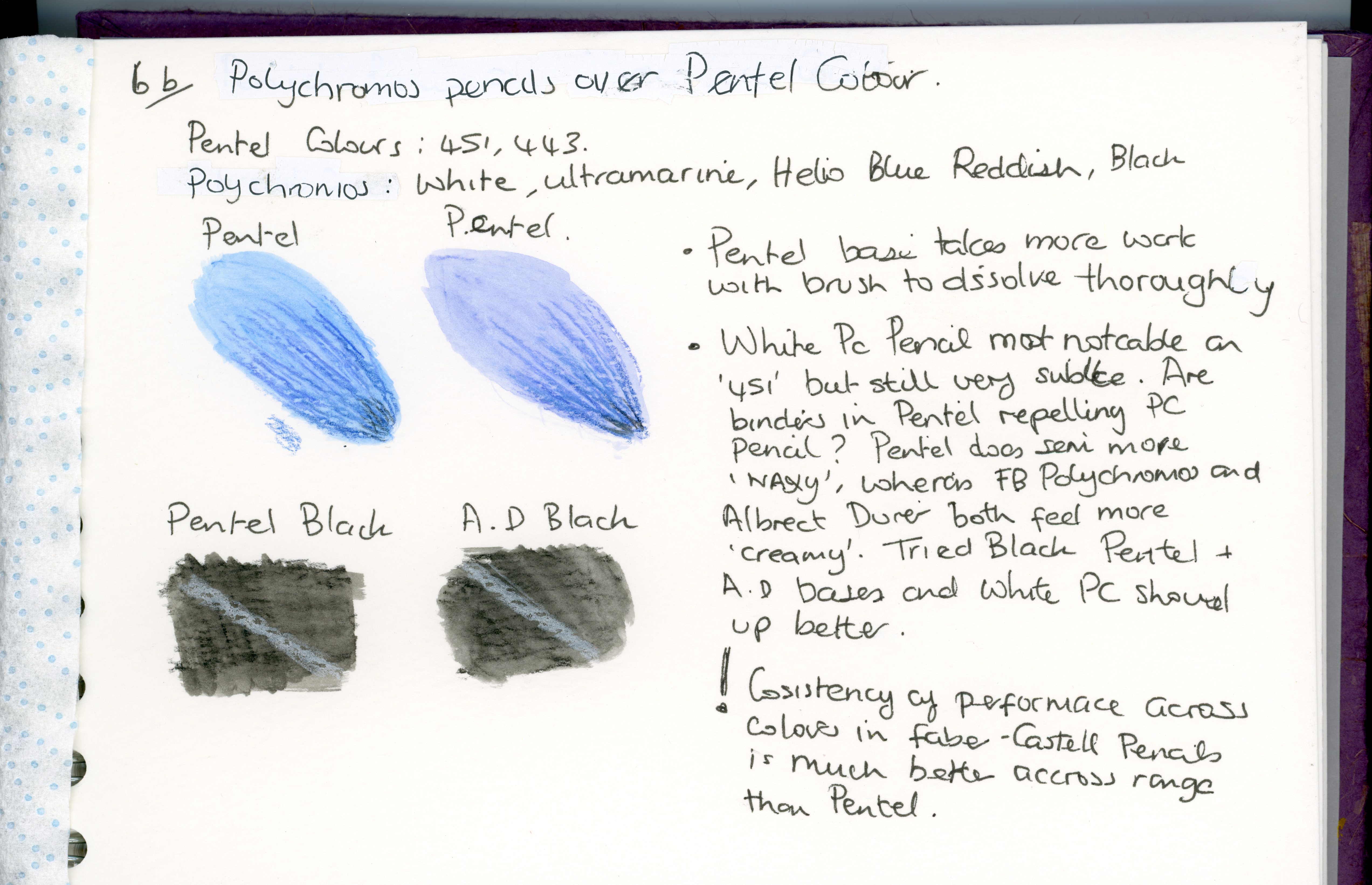
6.How do Polychromos pencils perform over activated watercolour pencil once dry?
For this test, I selected Albrecht Dűrer pencils in Helioblue-Reddish and Ultramarine, Pentel colour 443 and 499. The Polychromos colours I chose were Ultramarine, Helioblue-Reddish, and White.
When I layered the Polychromos pencil over Albrecht Dűrer colours ‘Helioblue-Reddish’ and ‘Ultramarine’, the white pencil had the biggest affect on the Helioblue-Reddish, though it was still subtle.
What I found interesting was that the Helioblue-Reddish Polychromos Pencil looks warmer when placed over it’s own watercolour equivalent and cooler on the Ultramarine Albrecht Dűrer pencil.
The white Polychromos pencil showed up best when used over the Pentel black watercolour pencil, though neither were particularly impressive.
When I was laying down the dry layers of watercolour pencil, I did notice that the Pentel colours felt more ‘waxy’ than Albrecht Dűrer, and I do wonder if there’s a higher wax content in cheaper watercolour pencils which tends to repel anything you try to put on top of it later.
My general feeling after conducting this test is that Faber-Castell pencils perform in a very uniform fashion across the whole range.
7.Comfort and ease of use.
My personal preference for barrel shape in pens and pencils is hexagonal or triangular, as I find this most comfortable and effective in staving off cramp, so the basic shape felt good on both pencils. However, the thicker barrel of the Albrecht Dűrer pencil was the more comfortable of the two, and I could use this for longer periods before my hand got tired and I needed a break.
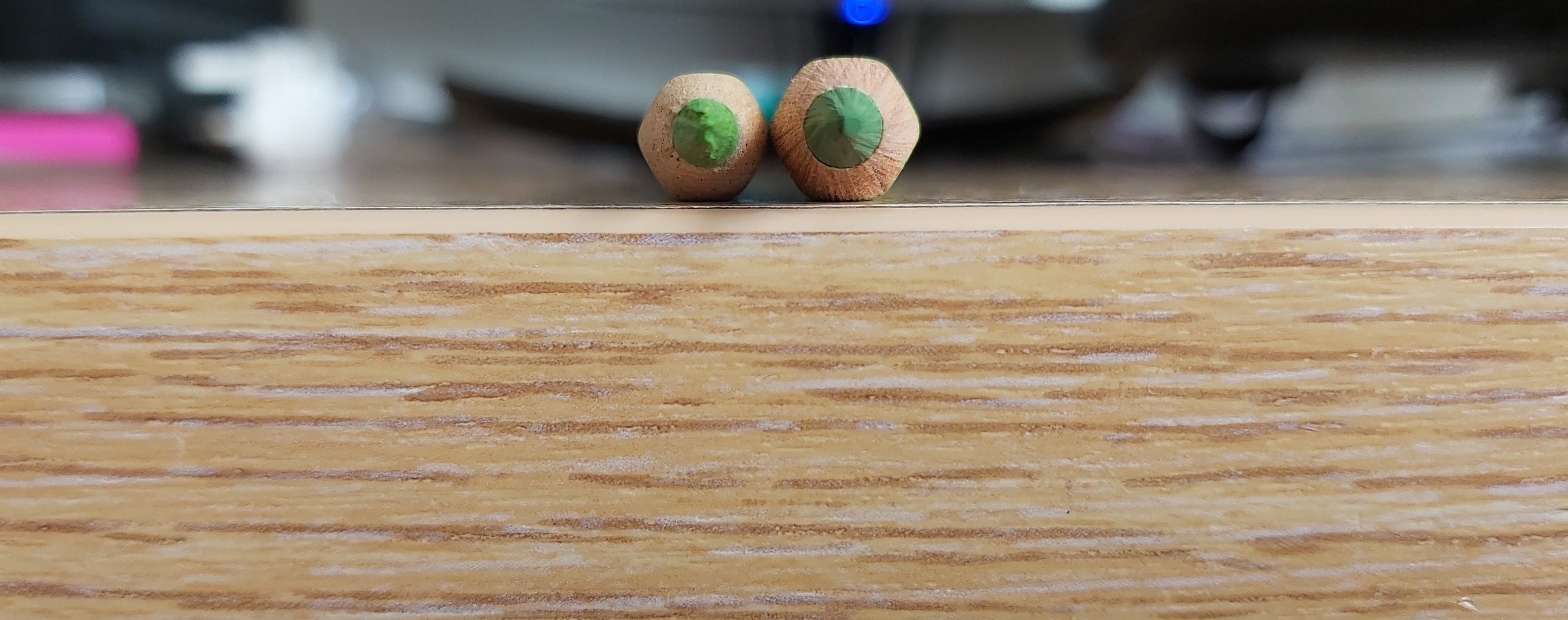
Pentel core (left) and Albrecht Dűrer (right) core.
I felt like the higher quality core of the Albrecht Dűrer pencil made for a more enjoyable experience as it took less effort to get good coverage and saturated pigment when activated.
The weight of the Albrecht Dűrer pencil, combined with the thicker core gave me extra confidence in mark-making as I wasn’t worried the point would break if I used more pressure, unlike the Pentel pencil which felt more delicate and as if it could only be pushed so far before it would break.
8. Are the pencils easy to sharpen? Do they break often?
For this test, I used the Faber-Castell 2001 Grip Trio Sharpening box.
Whilst it was easy to sharpen both pencils, I found that the Pentel Pencil broke more frequently despite being handled gently. I also noticed that the Pentel cores were already broken in a few places before I attempted to sharped them. Most of the Pentel cores were ‘off-center’ in the barrel, which may have contributed to their propensity to break.
10. Colour range.
Both sets have a nice range of colours. The Albrecht Dűrer set seemed to offer a more useful selection of warm browns, whereas the browns in the Pentel set all seemed to be more red-hued. The nearest colour to ‘Burnt Umber’ in the Pentel set also appeared to be more of a ‘mustard’ colour.
As for the greens, the Albrecht Dűrer set offered the better range, though I would have liked to see the Phthalo Green and Emerald – which I felt are too blueish – replaced with something like Permanent Green and Leaf Green to better compliment the Light Green and Earth Green Yellowish in this set. I’d even go so far as to ditch the white pencil completely and have 5 good natural, complimentary greens in the set instead.
I’d say the colour range of the Albrecht Dűrer set is more naturalistic, whereas the Pentel colours are pastel ‘candy’ colours which lend themselves to a very particular style of art.
The Pentel set does not come with any information on light-fast ratings (which leads me to assume none of these pencils are light-fast), unlike Albrecht Dűrer which has light-fast ratings ranging from 2 stars (very good light-fastness for 25 years+) to 3 stars (100% light-fast for 100 years or more). 11 out of the 24 pencils in the Albrecht Dűrer set have a 3-star light-fast rating.
One thing that REALLY irritated me about both sets was the gold writing on the barrels which made the colour codes extremely hard to read, especially on the lighter colour pencils. To both companies, I would suggest a black band on the barrel with the colours written inside this band, as this would make them so much easier to read.
Conclusion.
Whilst the Pentel set is impressive for the price point, and more than adequate for a child’s school bag, if you’re looking for a decent range of saturated, usable colours that wont fade, I would not hesitate to pick the Albrecht Dűrer range.
The main advantage both the Albrecht Dűrer and Polychromos pencils have is that you can buy individual colours when each pencil runs out, whereas you’d have to buy a whole new set of Pentel Arts pencils if you ran out of one colour.
Another advantage of being able to buy individual colours is that you can try a colour you use very often – like green – before you invest in the whole set. You could even build your collection one pencil at a time if you had budget constraints.
I also feel it’s a good idea to start with a decent brand when you’re venturing into a new medium, as struggling to get decent results with a poor quality item – be it pencils, paints or whatever – could frustrate a beginner and lead them to abandon that medium altogether.
Ultimately, when deciding which of these sets is for you, I would say it’s a case of weighing up the importance of light-fastness and consistent quality against your budget. Would you be happy with a complete set of the cheap and cheerful Pentel pencils (bearing in mind the downsides discussed in this review) or would you rather assemble a quality set one pencil at a time?
WP has kindly reminded me it’s time for my weekly blog.
The weather has been so truly foul that I’ve not ventured outdoors at all, so nothing exciting to report. I was supposed to be going Blokarting this weekend but the weather’s seen to that! Poopy.
I shall, instead direct you to my Instagram account as I’ve been playing with that this week.
I really didn’t see what the big deal was when I first saw people jumping on the Instagram trend but with the purchase of a smart phone I decided to give it a go and I love it! I have lacked the enthusiasm to be creative since I graduated from my Art degree but something so simple makes you think really hard about what you want to photograph and it’s reignited my spark!
I’ve also continued to give my Red Bubble portfolio a major clean up and I’m hoping that’ll help prompt some sales. I think switching my focus more to Android and Iphone and Ipad covers might have been a good move, but we’ll see.
Hope this blog finds you all well. I have a portfolio on a website called RedBubble and I’ve updated my shop to bring you iPod/pad/phone cases, as well as Android and the usually selection of prints.
Adventures don’t have to be massive undertakings involving discomfort or huge physical effort. Anything new that puts you a little outside your comfort zone is a good thing.
With that in mind I tried my hand at Willow Weaving last weekend with a lovely man called Ivor Hancock who is nearly 80 and has been a weaver since he was 14.
You can watch Ivor talking about his life and work HERE
We made a simple bread tray that would take him about half an hour….and took me 6 and a half hours! haha. It’s way more physical than I had anticipated and I was really glad of the weight training I’ve been doing for the last year! I got in a pickle a few times but Ivor was very attentive and reassuring, helping me undo and re-weave rows until I got it right. The end product is small and slightly wonky, but useful. A bit like me. 😛
I definitely want to try this again because it was difficult but I enjoyed the challenge and would love to get it right. I checked out the tools and materials I would need and once you have the tools (which come in at about £50 in total) it’s actually a relatively cheap hobby.
Today I want to reflect on my time at University and weather – with the imminent roll-out of astronomical tuition fees – I would do it again or advise others to go to University. But before we get to the main event, let me give you a little background.
From the age of 13 I was determined to go to University. I was one of the first disabled children to attend mainstream school in the UK in the mid-80’s and it gave me a determination to ‘prove myself’ beyond high school and I wanted to go to University. What I was trying to prove and who I was trying to prove it to is anybody’s guess – as a recipient of unconditional love from both my proud parents I didn’t exactly NEED to garner any respect or attention – but I do remember being spurred on by the sight of all my able-bodied cousins beaming down at me on their caps and gowns from my Grandparent’s mantle piece (just to be clear, these were photographs and my grandparents didn’t actually posses an industrial strength mantelpiece).
So, with that said, kindly fasten your seatbelts and be sure to keep your arms and legs inside the carpet*. Off we go….
Fast forward 20 years and having gone straight into work from high school, then moved to another part of the country I decide that in the absence of a job (a whole other story in itself), that it was time to embark upon another course of study to stop me chewing the furniture. I chose a Foundation Degree in Applied Art and Design because this meant I could combine my love of art, music and technology to create some interesting work. I found a course attached to a University but based in a local college that sounded exactly right for me and enrolled. Everything was great for a month or three until cracks in the curriculum and teaching started to show. My first alarm bell should have gone off when the very module I wanted to explore – Lens Based Media – lost it’s one and only lecturer and she wasn’t replaced. I was now left pretty much to my own devices to study my medium alone. Luckily I had made friends with another student who was also concentrating on lens based media and that gave me someone I could share ideas and influences with, but it wasn’t really the same as the guidance I had received from my former tutor. My friend was a full time student and I was part time so in my final year I was left to explore my medium alone. This resulted in me allowing myself to be talked into changing my medium and that was the single worst mistake I made. LESSON ONE: KNOW YOUR MIND AND STICK TO YOUR GUNS. Don’t assume that a tutor knows more than you about your medium just because they’ve got the BA/MA/Doctorate and you haven’t.
LESSON TWO: KNOW WHAT YOU’RE PAYING FOR.
The course title (‘Applied Art and Design’) had given me a certain expectation that the primary focus of this course was to build on my existing skills in a very practical sense and then teach me additional business skills I needed to make my art profitable in the real world. However, in the second year of my course we were informed that the Business Studies element of the course would not be delivered unless we went on to study the BA ‘top up’ course. I was not alone in being attracted to this course specifically for the business element (business studies within the context of the Art industry is different to general business studies) so my fellow students and I were understandably angry about this unexpected change to the course. We did get a few guest lecturers who were interesting but only touched briefly on the business aspect of their practice. We did have one module centred on commissions but again business practice was not discussed in the depth which the prospectus had led me to believe it would be discussed. In short, it was not the hands-on real world experience of the artist’s JOB that the title of the course had suggested.
Now, allow me to digress slightly with a hypothetical scenario. Say you decide to have an extension built on your house. The builder tells you exactly what this will entail, how long the work will take and what you are paying then a few weeks into the job the builder just doesn’t turn up when you’ve agreed to re-arrange your schedule to meet with them. When you do finally manage to locate him, he cites too much work to do on other jobs as the reason he has disrespected the agreement you had in this manner. You’d be pretty pissed off yes? Well now you’re a student handing over £9K a year only to find that your tutors are changing module deadlines with little or no notice (sometimes on the day an essay is due to be handed in – yes this really happened!), you turn up for lectures only to be told they are cancelled and entire steps are missed from modules because a tutor has bitten off more than they could chew and was marking work from several other courses when they should have been teaching youand markingyourwork. Hands up, who’s for a refund?
And all this before we’ve ever considered the way the establishment deals with disabled students. A compulsory element of my course was to attend trips to art Galleries in London and Cardiff. How many trips did I go on to these locations? Not a single one. Despite repeatedly pointing out to ‘the powers that be’ that the coaches were not accessible for my wheelchair nothing was done to rectify the situation (but a suggestion was made that I take the train at my own expense – nobody bothered to check in with me to find out I wasn’t entitled to Disabled Students Allowance!). I managed trips to local art galleries with the help of fellow students who had cars and were willing to give me a lift.
I can actually drive but was never sure of getting a disabled parking space on Campus due to various able-bodied people taking up spaces. Another thing I complained about (and provided photographic evidence of) on numerous occasions that nothing was done about. When an able-bodied member of staff (a janitor) was tackled about using disabled bays this was his response (I shit you not!): ‘No worries, when she wants the space just let me know and I’ll come and move my car’. Anybody want to join me in banging their head on the desk right now? I think this culture of ignorance wore me down just as much as the problems with the course itself.
Life after University
The prospectus for this particular course states the following career opportunities are available post-graduation:
Self employment as an artist/ Designer/craftsperson
Gallery/museum administration
Community-based art work
Prop making for theatre, television or animation companies.
Well, I can tell you right now that I would not be confident in any of these roles other than self-employment (I’m completely self taught in my current art practices) because the guidance I received was just not sufficient to send me off into the world of work in the Art Industry. I left that course more confused and unsure of my own abilities as an artist than I was before I started and so when I heard about the plans the University I attended had to charge ‘top whack’ in fees, it sincerely worried me that future students would be wasting their money.
However, it’s not just students wasting money that bothers me. Employers also need to know that when my CV says ‘Foundation Degree in Applied Art and Design’ that they are getting somebody who knows their arse from their elbow in that particular subject! Poor quality courses and tuition don’t just cheat the student, they cheat employers too. It’s reasonable for both parties to expect that having a degree means a person possesses a certain standard of competency in that subject. Hiring someone who’s got it on paper but can’t actually do the job properly is bad for the employer, who has to cut them loose and bad for the former employee who is now looking for a job!
I was lucky enough to have been able to get a Local Education Authority grant (I gather these may also be scrapped) when I did my course, but had I been forced to pay for my three years at University, right now I’d be asking for my money back. Had I been able to pay I would have had no problem with the principle, but I am very aware that this would also make me a CUSTOMER of the University and as such those paying for the services they deliver have a right to expect good value for money. People who NEED degrees to have a career like doctors have even more right to demand reasonable rates and good value for money from their Universities.
So, is University really all it’s cracked up to be? When I sit and think about what a University education really meant for me, I can’t actually say it enriched me on a personal level, and I certainly didn’t learn anything I couldn’t teach myself (and in fact I did exactly that on more than one occasion!). Although I did learn from looking at some of my tutors that you can spend many, many years in academia and still be as dumb as a box of bricks!
If I had that time over again, I can think of cheaper and more enriching ways to learn what I needed to know. I’m still involved in art but in a totally different way. It’s taken me precisely 9 months to teach myself a new discipline and build up the confidence to seriously consider turning my art into a business. My University, despite what the brochure said, failed to accomplish this in three years of study.
As I said before, there are some careers for which a degree is the ONLY way you’ll get your foot in the door so for those people I’d like to offer the following advice when choosing a University:
Make sure what YOU expect to get out of the course is what will actually be delivered to you. If having discussed your needs and expectations with the course manager or head of faculty you realise that it won’t meet your needs then look elsewhere – Universities are now a business. You are the customer and they are not doing you any favours so make sure you are getting value for money and if you are in any doubt of this then take your business elsewhere. 9K is a hell of a lot of money to spend (or a lot of debt to acquire) if your course isn’t going to provide you with the skills and guidance you need.
If you are disabled, ASK ABOUT THEIR POLICY FOR DISABALED STUDENTS. Are any areas of the college or aspects of the curriculum that disabled students may have problems accessing? If you are given a tour of the University seek out disabled students and ask them what their experience is of staff attitudes to inclusion. I actually advised a prospective student with a disability not to study at my university because I felt their attitude was so bad and I didn’t want her to suffer the same disappointment and frustration that I had.
Talk to former students of the course you are thinking of joining. Ask them how they enjoyed the experience and weather the knowledge they came out with actually matched their expectations when they started.
Ask what happened to the students who graduated from your prospective course. Did they get jobs? Become self employed? Continue their studies?
I hope the retelling of my experiences here is of some use to you and if you’d like to add this blog as a ‘guest’ post to your readership then please get in touch with me. The more of you who are willing to challenge Universities on exactly what you’re getting for your money the better off you’ll all be.
*If you don’t recognise that quote, you don’t watch enough Disney movies.