
Aquatic Warblers successfully translocated to Lithuania – BirdGuides
Hybrid stork chicks may be world first – BirdGuides
Review: Scrawlrbox #092
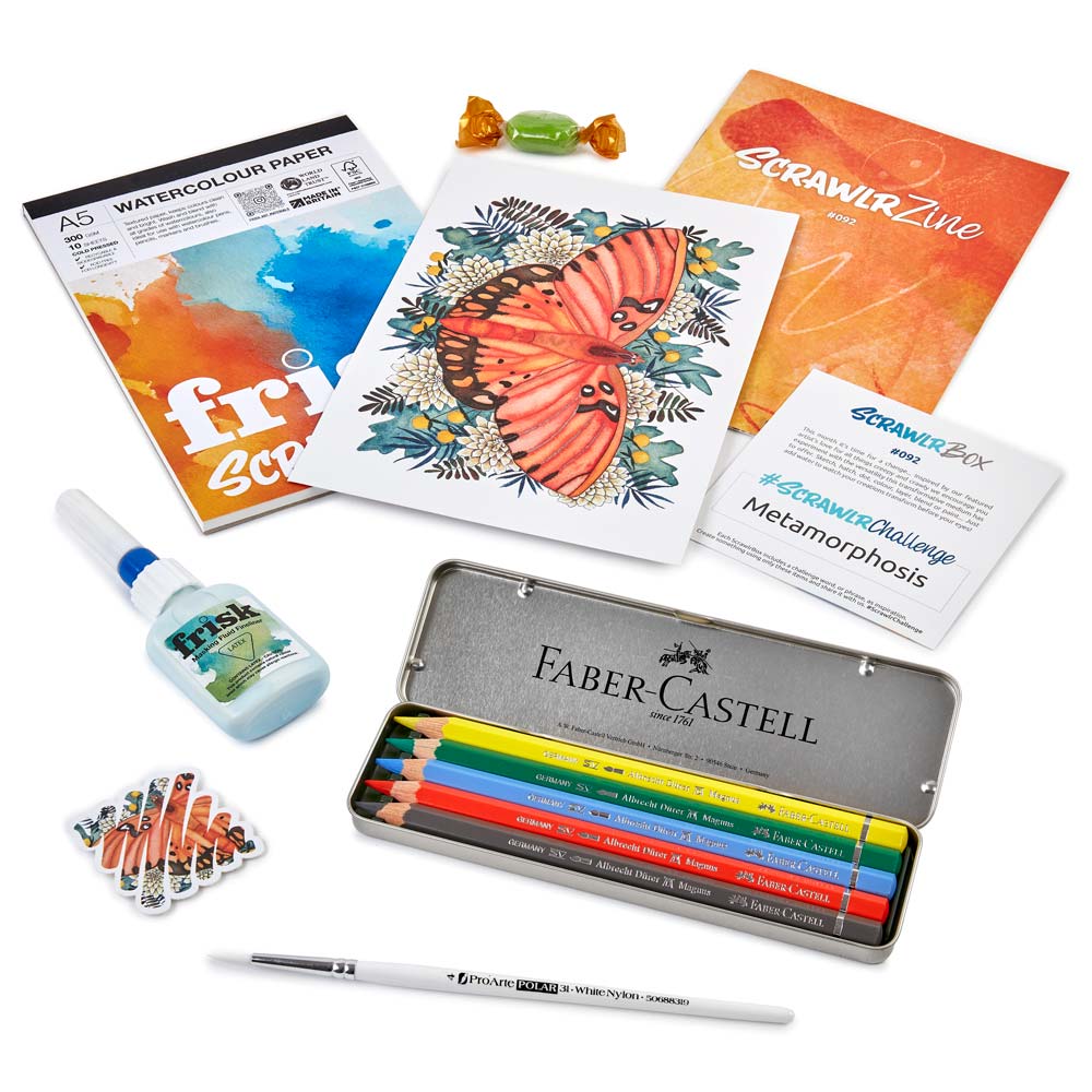
Faber-Castell is a brand I use regularly in my own practice, so this box was a fun one for me.
The colours included made sense, and the inclusion of a grey pencil was welcome as it meant I could tone down the brighter colours included the tin.
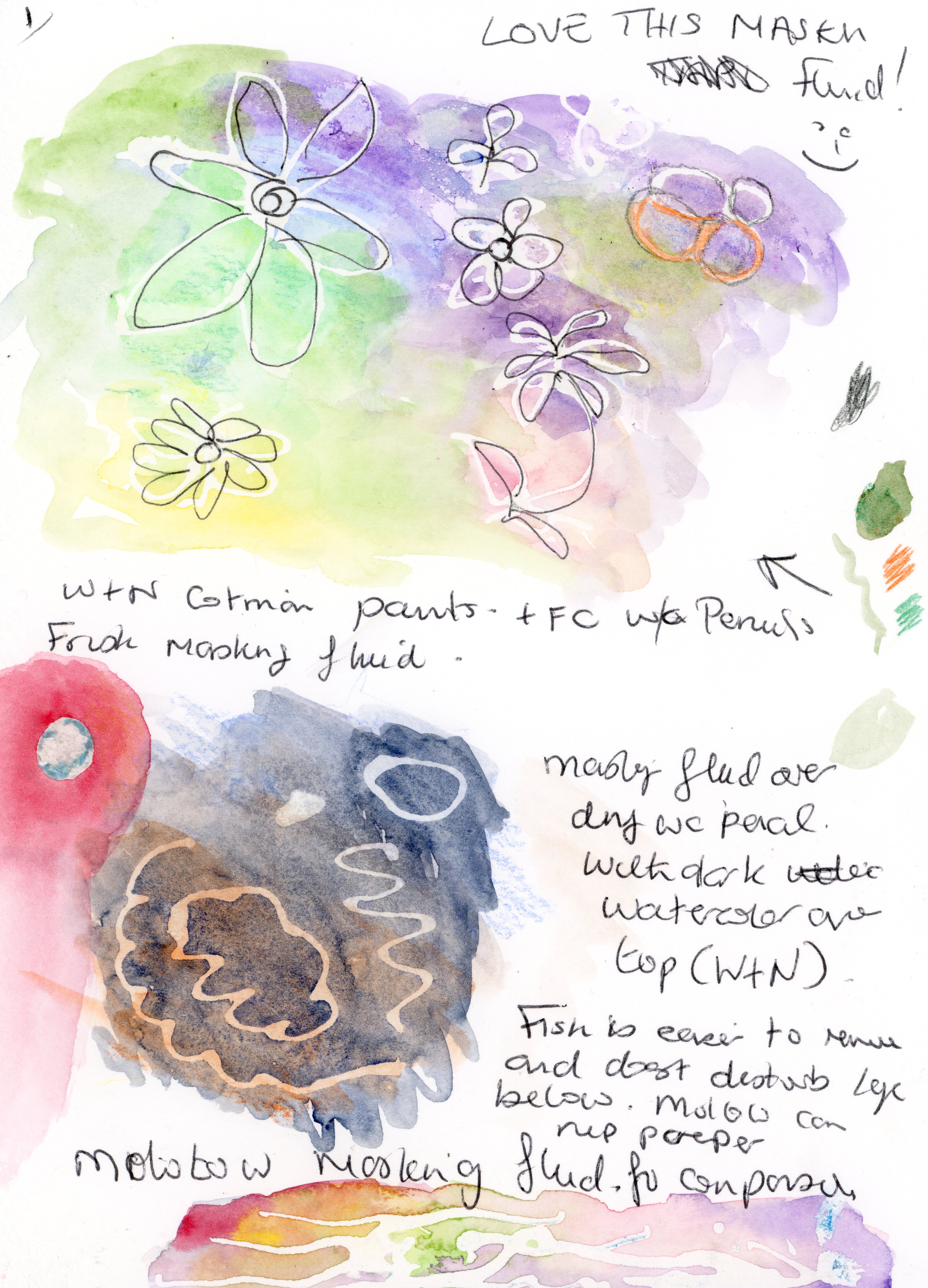
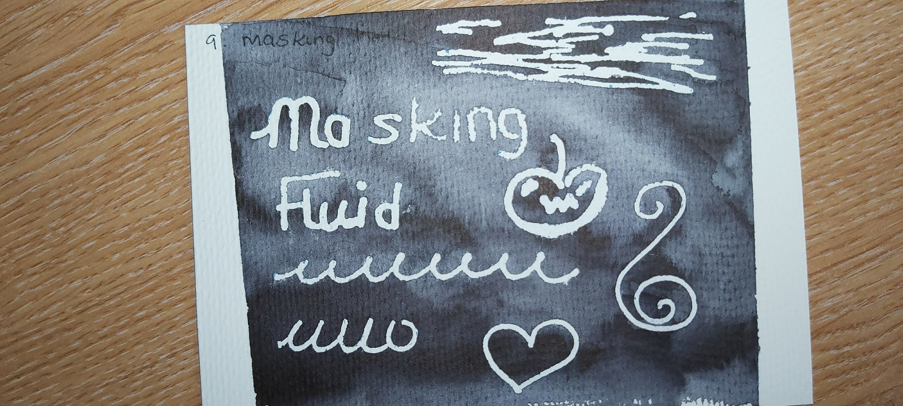
Previous experiences of masking fluid have been quite hit-and-miss for me, so I was interested to try this brand and I was not disappointed. The fine nozzle left crisp lines, and although it takes some practice to learn to control the flow of masking fluid, once you find your own technique, it’s really fun to use, and you can get some interesting effects. One thing to be aware of is that the masking fluid will peel off if you use too much water. It also copes well with a heat gun if you wish to hasten the drying time.
I also tried the masking fluid with acrylic inks and various brands of watercolour, and all worked equally well. One thing I would say is to try and keep layers of masking fluid thin as if it’s applied too thickly, it will tear the paper when you try to remove it, regardless of which brand of paper you use.
I really like ProArte brushes, so I give this one 10/10.
I’d give the paper 8/10. It handles wet-in-wet techniques well and colours bleed into each other seamlessly. The only reasons I gave this paper 8/10 is because if you use too much water it pills quite easily once wet, and it does curl with relatively small amount of wet media and doesn’t flatten when dry, but this could be rectified by placing your dry piece between two heavy books.
All in all, I’d recommend this box if you’re already a fan of watercolour pencils or you’d like to try them.
Scrawlrbox January 2023
NOTE: Photographs of each test can be found at the end of this blog.
I was very pleased to get coloured pencils this month as this is a medium I use regularly.
The Derwent Fine art Pencils seem a little harder than the Chromaflow range, so you need to apply more pressure to get the same colour pay-off. I found this to be the case regardless of the paper I used.
The colours were nice but a struck me as a little odd, given the prompt of ‘Dish of the Day’. I feel this is a recurring theme with Scrawlrbox and a little more thought could go into how the supplies work with the prompt. I think Oranges, yellows and greens would have made morse sense with the prompt we were given.
Whilst I appreciate the potential to ‘think outside the box’ with colour selections for everyday objects, I think someone new to this box – and maybe also new to art – might just want to be creative with colours that ‘make sense’. Even intermediate or expert artists might just want to relax with their Scrawlrbox and not overthink the process.
Now to the blender pen.
It has a very strong smell which doesn’t seem to fade with time. I compared the pen with alcohol-based rose water and the results were almost identical. For that reason, I don’t think I’d buy this blender pen again. I was also disappointed that it is neither refillable nor recyclable.
I tried the blender pen with Derwent Chromaflow, Faber-Castell Polychromos and POSCA pencils, and found that it worked better with these brands than the Fine Art Pencils, which needed at least 4 layers to achieve a nice blend, whereas the other pencils only needed one or two layers.
I really liked the ‘B2P’ ballpoint pen. It’s comfortable to hold for long periods of time and writes very nicely. I’d never thought to draw with ballpoint pen before, but the performance of this pen made me want to try it.
I already have a large ‘Seawhite of Brighton’ sketchbook, which I really like, so I found this ‘concertina’ sketchbook a bit disappointing regarding how it performs with coloured pencils. The paper is incredibly soft, which made getting any decent colour down very difficult, even when using Polychromos and POSCA pencils.
I also found that there was a lot of ‘feathering’ when using Pitt Artist pens.
One area where this sketchbook really gains points is the fact there was ZERO bleed-though when I used the Pitt Artist Pens, which means the other side of the paper isn’t wasted.
Next, I tried Alcohol inks with this sketchbook. The inks sink into the paper quite quickly and the colour spreads easily, so it won’t be possible to create fine lines, but this quality of the paper could still be useful depending on what effects you’re trying to create. I tried using the Derwent blender pen with these inks and they worked well, and I can see lots of potential for interesting effects.
I found this paper really worked nicely with acrylic inks and the colours layer beautifully if applied when the base layer is fully dry. You can also achieve sharp lines and detail, unlike the alcohol inks.
The paper takes watercolour paint quite well (although a light touch is needed to avoid pilling) and any buckling disappears completely once the paper has dried. ‘Wet in Wet’ techniques are particularly nice with this paper.
I also found the paper performed well with a graphite 2B pencil and erased completely.
I find the concertina format a bit unwieldy but that’s an entirely subjective opinion and just takes a bit getting used to on my part.
Lastly, value for money. As usual searched for the best price for each item with free P&P. This month’s total came to £25.09 which made this box excellent value for money.
All in all, I really enjoyed this box


Scrawlr Prompt: ‘Dish of The Day’

Birds that migrate together have similar calls, study finds – BirdGuides
I find this absolutely fascinating.
If you’ve just subscribed to my blog recently: ‘Hello! Hi! 😁. You can expect more of this cos I’m a massive Nature Nerd 🤓 🤣.
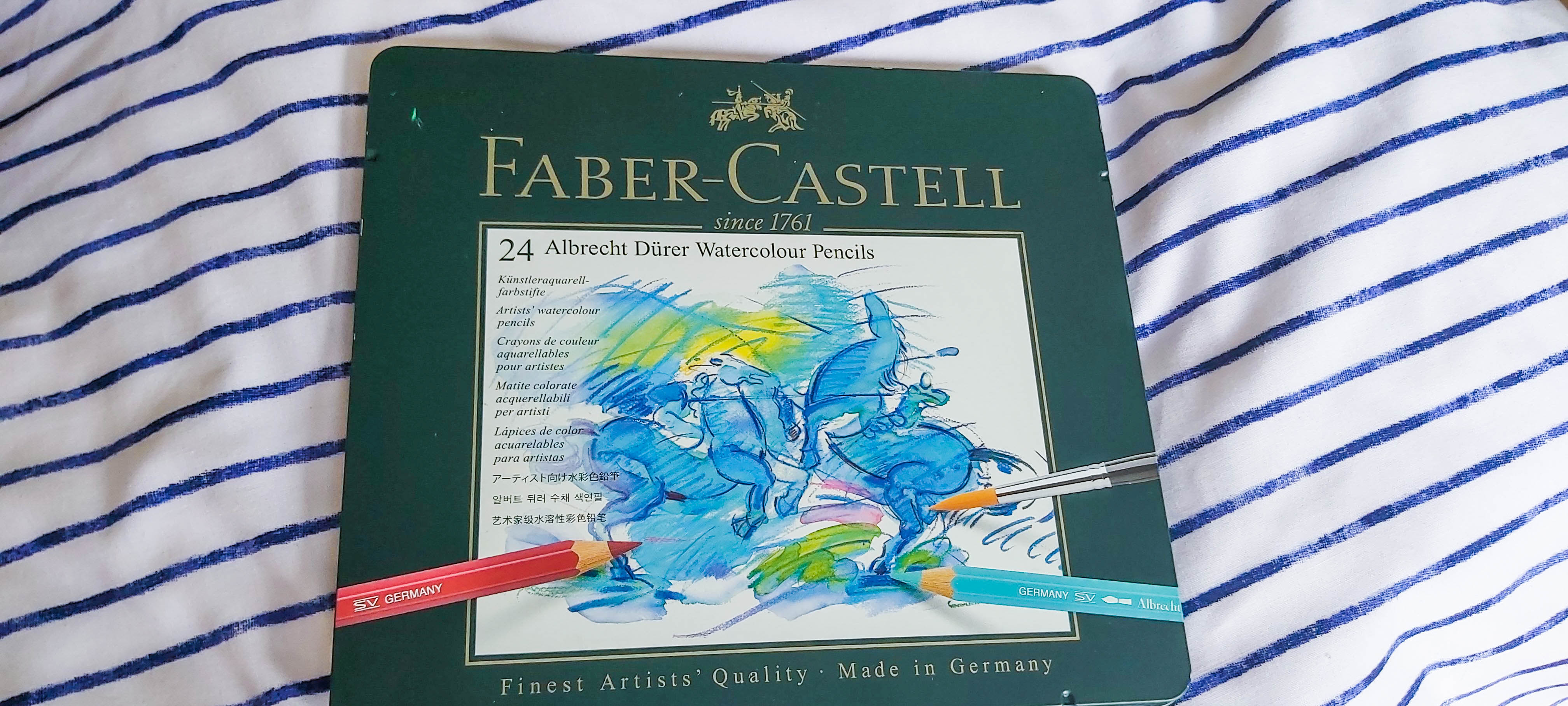
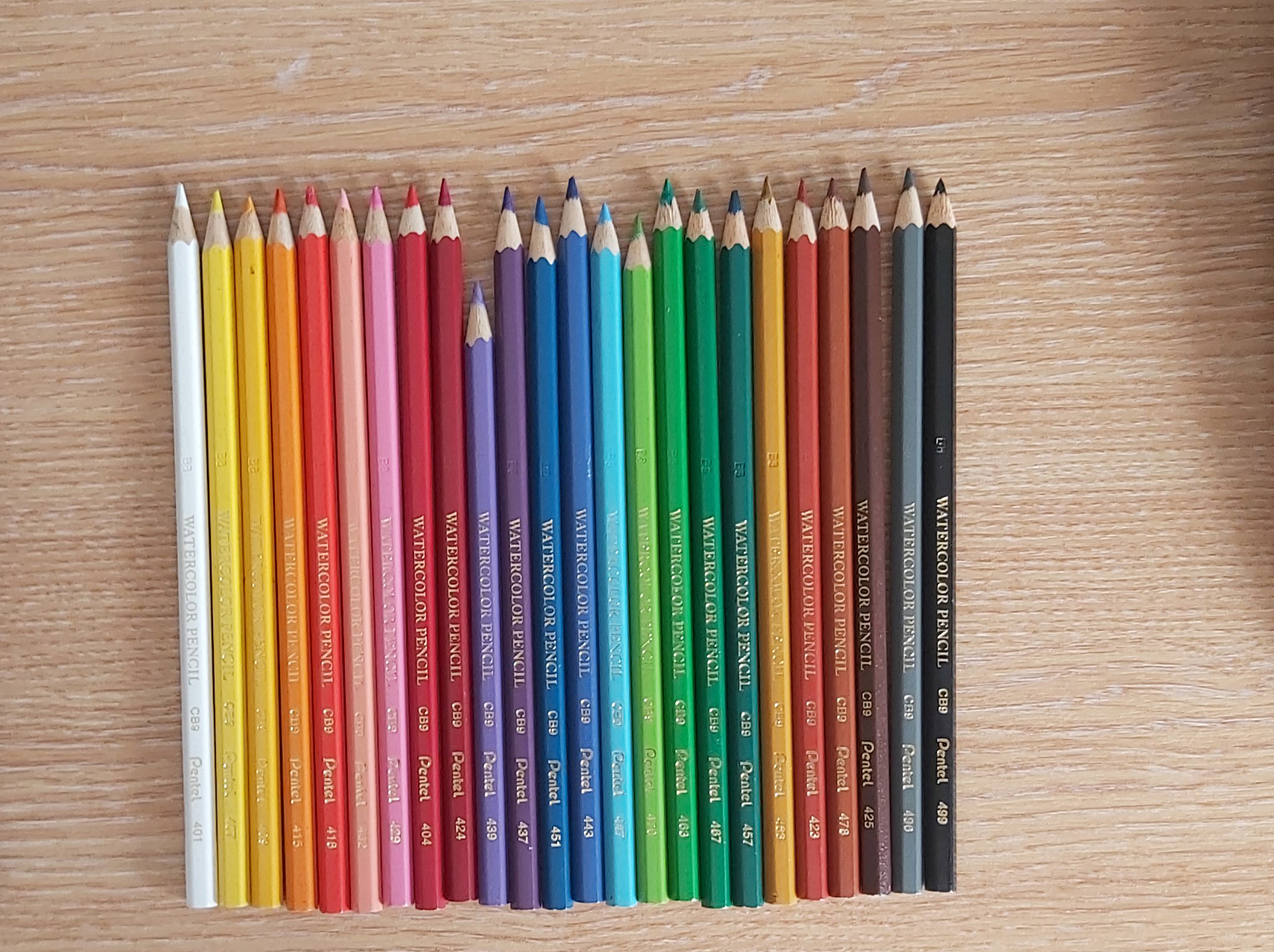
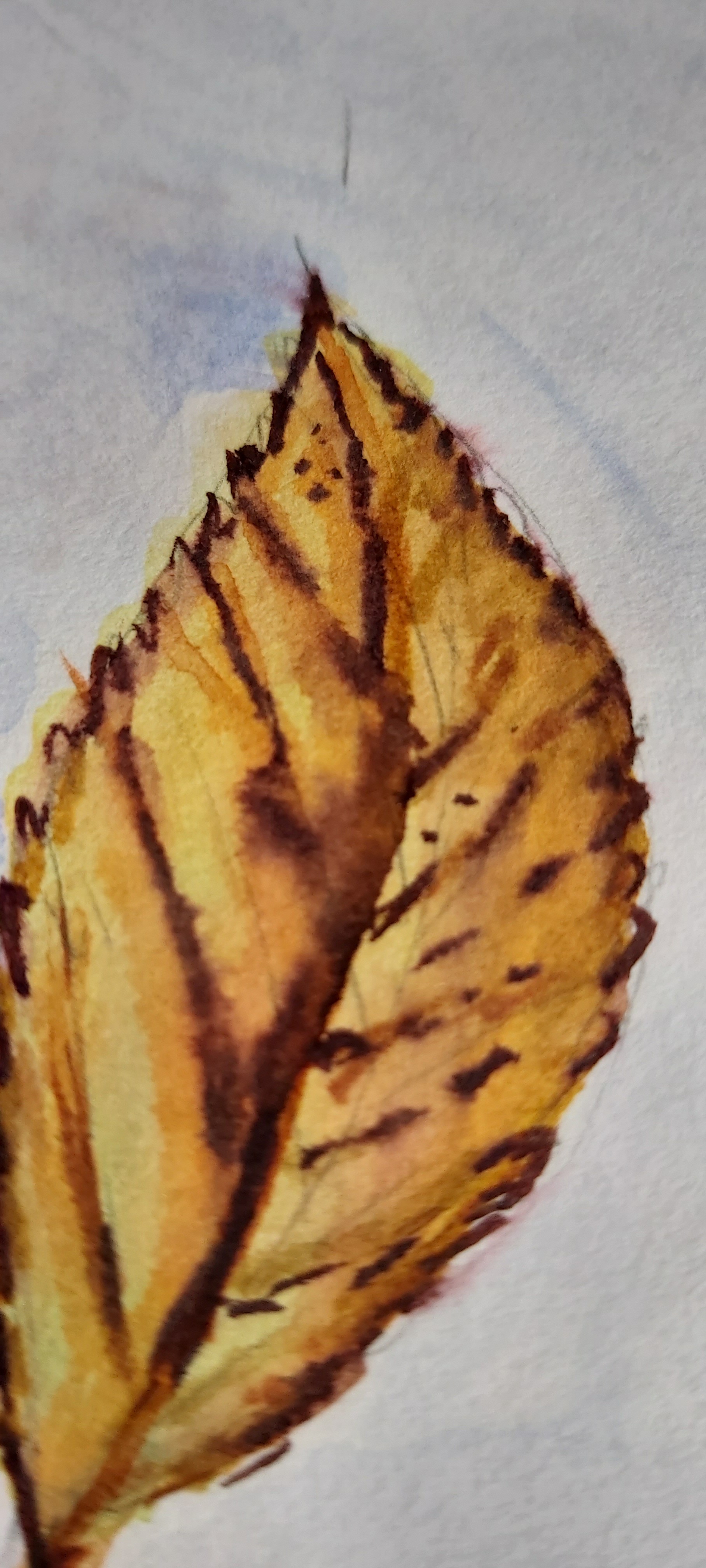
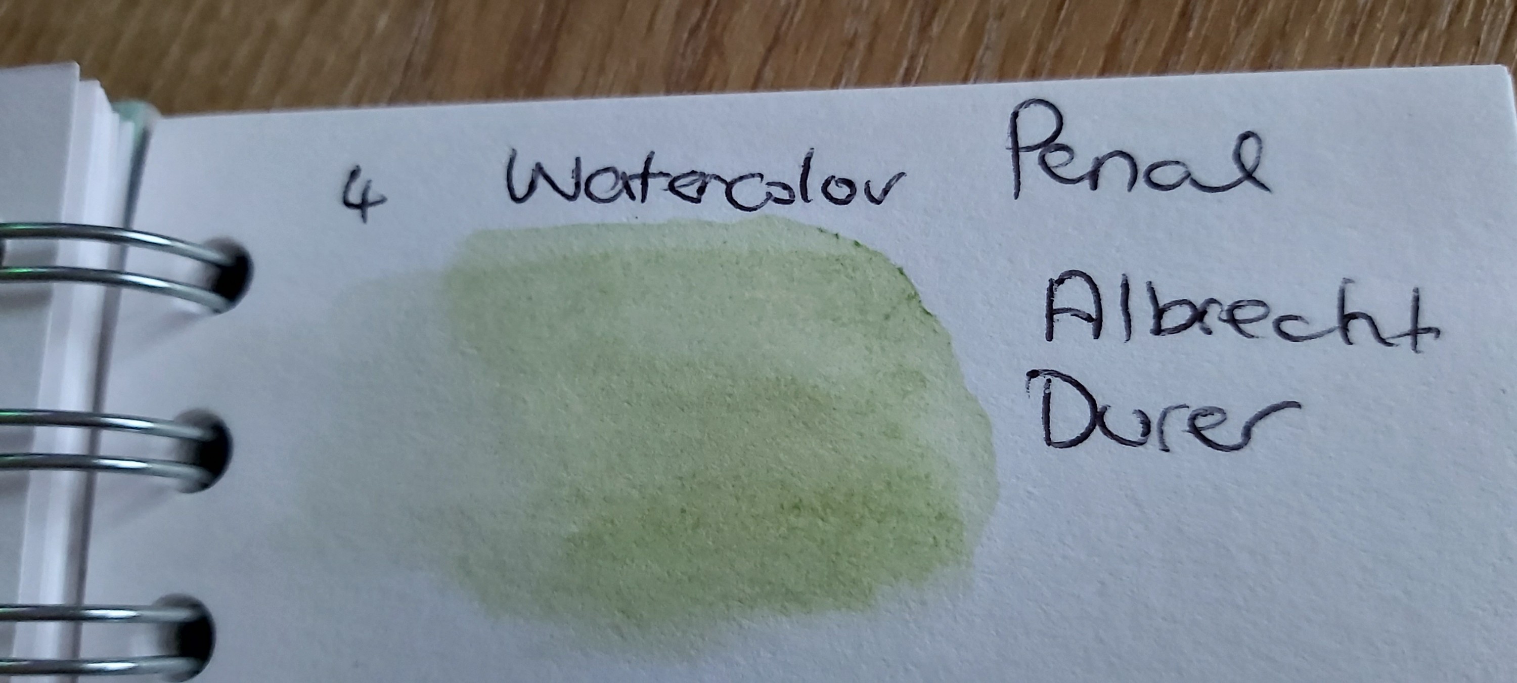
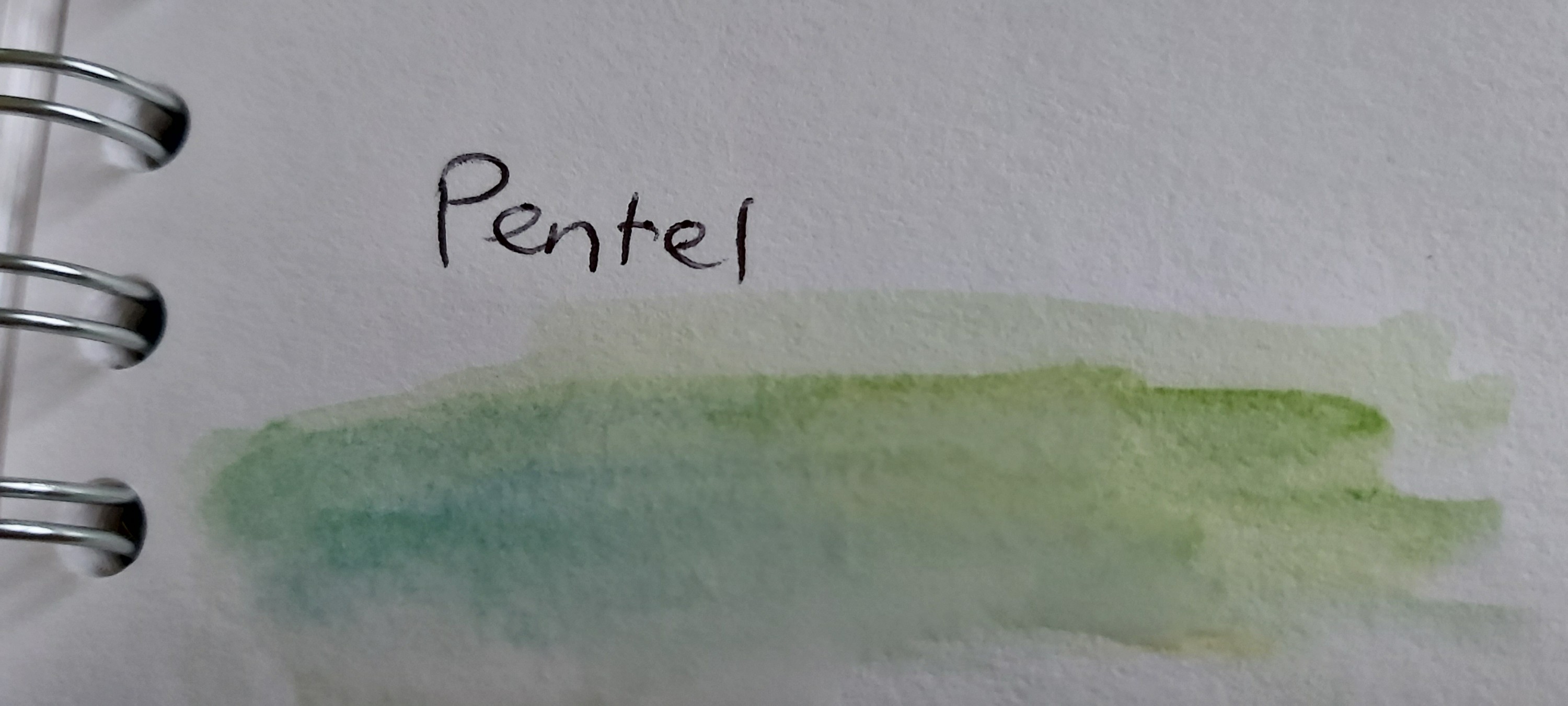
Watercolour Pencils: Faber-Castell Albrecht Dűrer v Pentel Arts
Price: Faber-Castell Albrecht Dűrer set of 24 = £27.80 (£1.15 each) from Amazon
Pentel Arts set of 24 = £6.69 (27p each) from Amazon
Tools:
- Pink Pig A5 Textured Ameleie 270gsm Watercolour sketchbook.
- Mozart Supplies water brush.
- Steadtler 0.1 pigment liner.
- Molotow masking fluid pen.
- Faber-Castell Albrecht Dűrer watercolour Pencils.
- Pentel Arts Watercolour Pencils.
- Faber-Castell Polychromos Coloured Pencils.
Criteria
- Colour intensity/Pigment.
- Mixing Colours.
- Transparency.
- Performance when used in conjuction with masking fluid.
- How easy is it to reactivate and lift colour once dry?
- How do Polychromos pencils perform over activated watercolour pencil once dry?
- Comfort and ease of use.
- Are the pencils easy to sharpen? Do they break often?
- Colour range*.
*NOTE: FOR THE PURPOSES OF THIS REVIEW I WILL ONLY BE TAKING INTO ACCOUNT THE COLOURS OFFERED IN THE ALBRECHT DURER 24 SET AND NOT THE FABER-CASTELL RANGE AS A WHOLE.
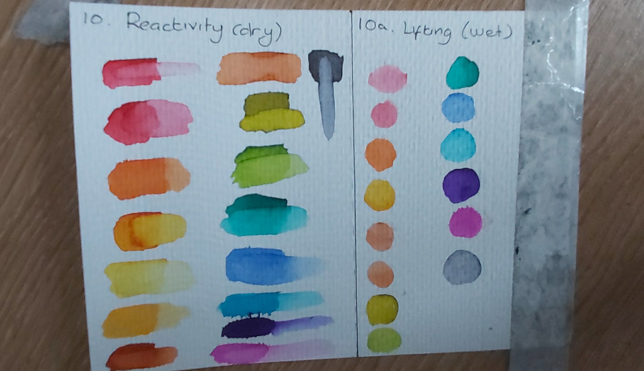
1. Colour intensity.

Although the Pentel colours are impressive for the price point, when I compare – for example – the magenta colour in the Pentel range (424) with it’s magenta equivalent (133) in the Albrecht Dűrer set, the difference in the richness and saturation of colour is obvious. I find the addition of a white pencil equally pointless in both sets, as neither are opaque enough when activated to offer any useful applications.
I also found that the Pentel magenta colour required the application of several dry layers in order to come close to matching the coverage and intensity of colour that one layer of Albrecht Dűrer produced when activated.
2. Mixing Colours
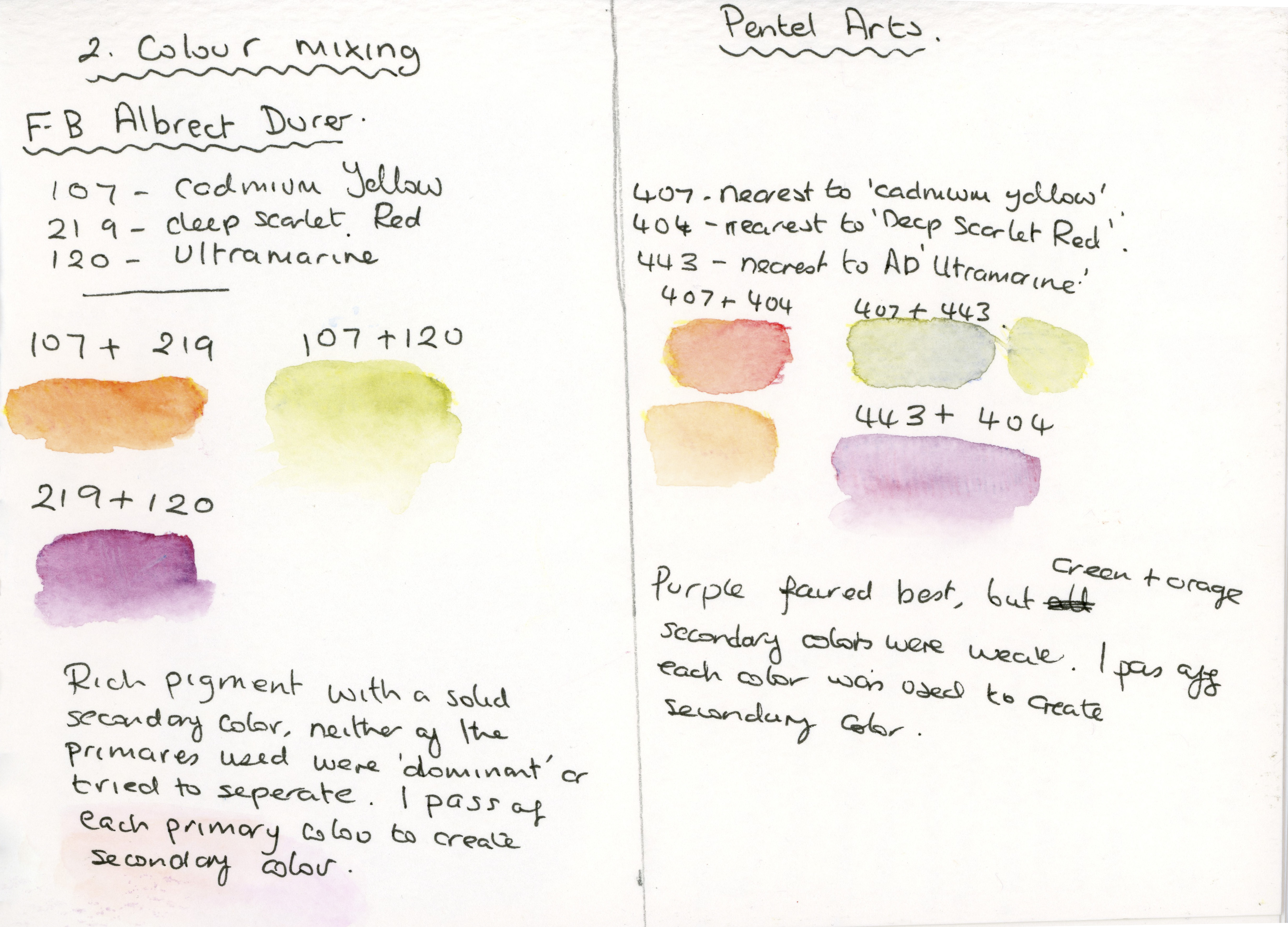
As you can see from my notes above, Albrecht Dűrer provided a nice vibrant, uniform colour when mixed (one layer of each colour) compared to Pentel, which offered a much more diluted colour, which is not necessarily a bad thing if you want to exploit this quality when you’re looking for delicate colours. What was of more concern to me was the Pentel colours’ propensity to separate, or for one of the primaries to ‘dominate’ the tint of the secondary colour, despite applying just one layer of each colour for both brands.
3. Transparency
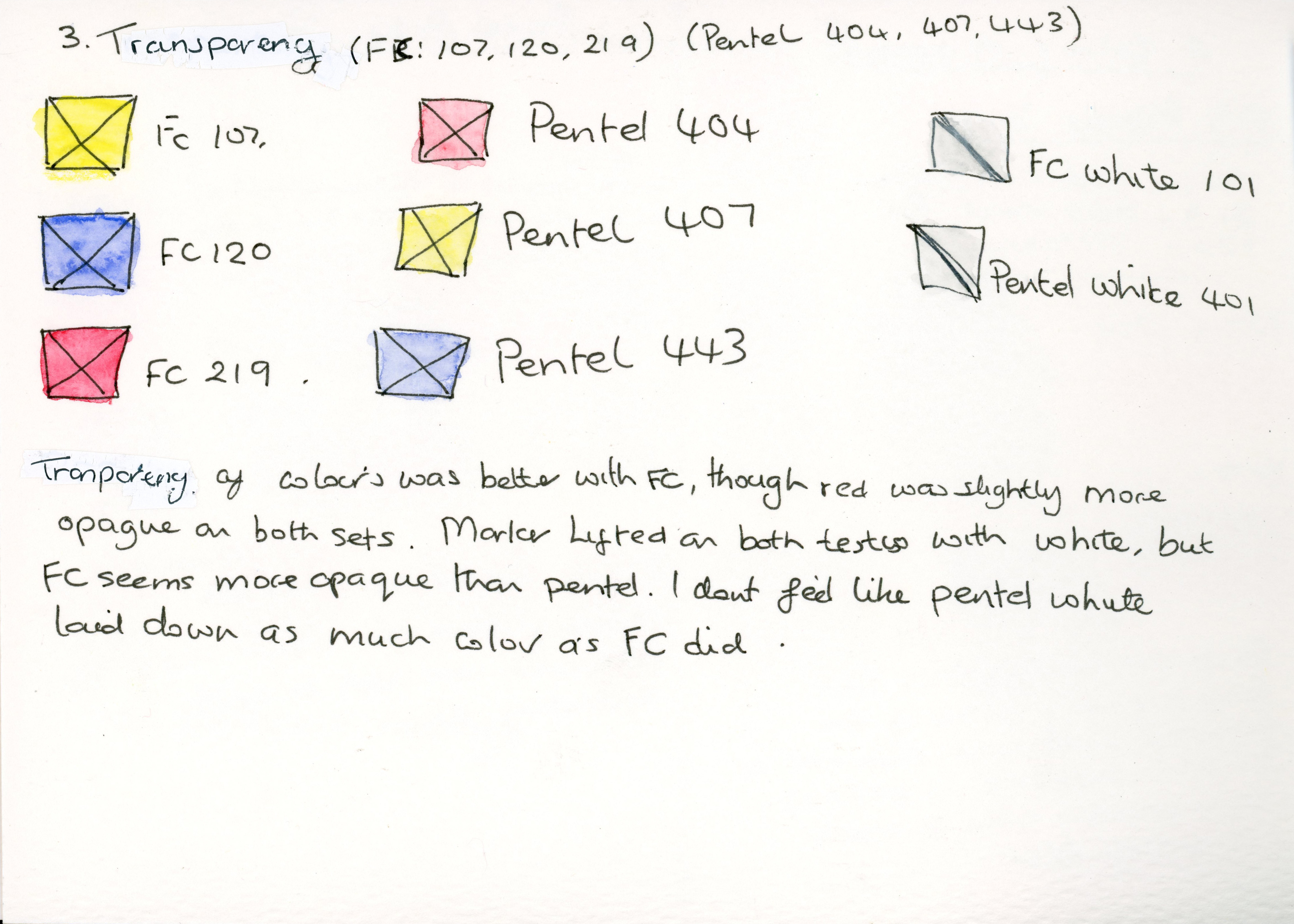
For this test, each box was created with Steadtler Pigment liners, then left to dry before applying watercolour pencil over the top.
Again, Albrecht Dűrer performed best, although the red in both sets showed the highest opacity (excluding the white in both sets, obviously). Interestingly, when I activated the white in both sets, it lifted the fineliner slightly.
The Albrecht Dűrer white pencil showed slightly more opacity than the Pentel white.
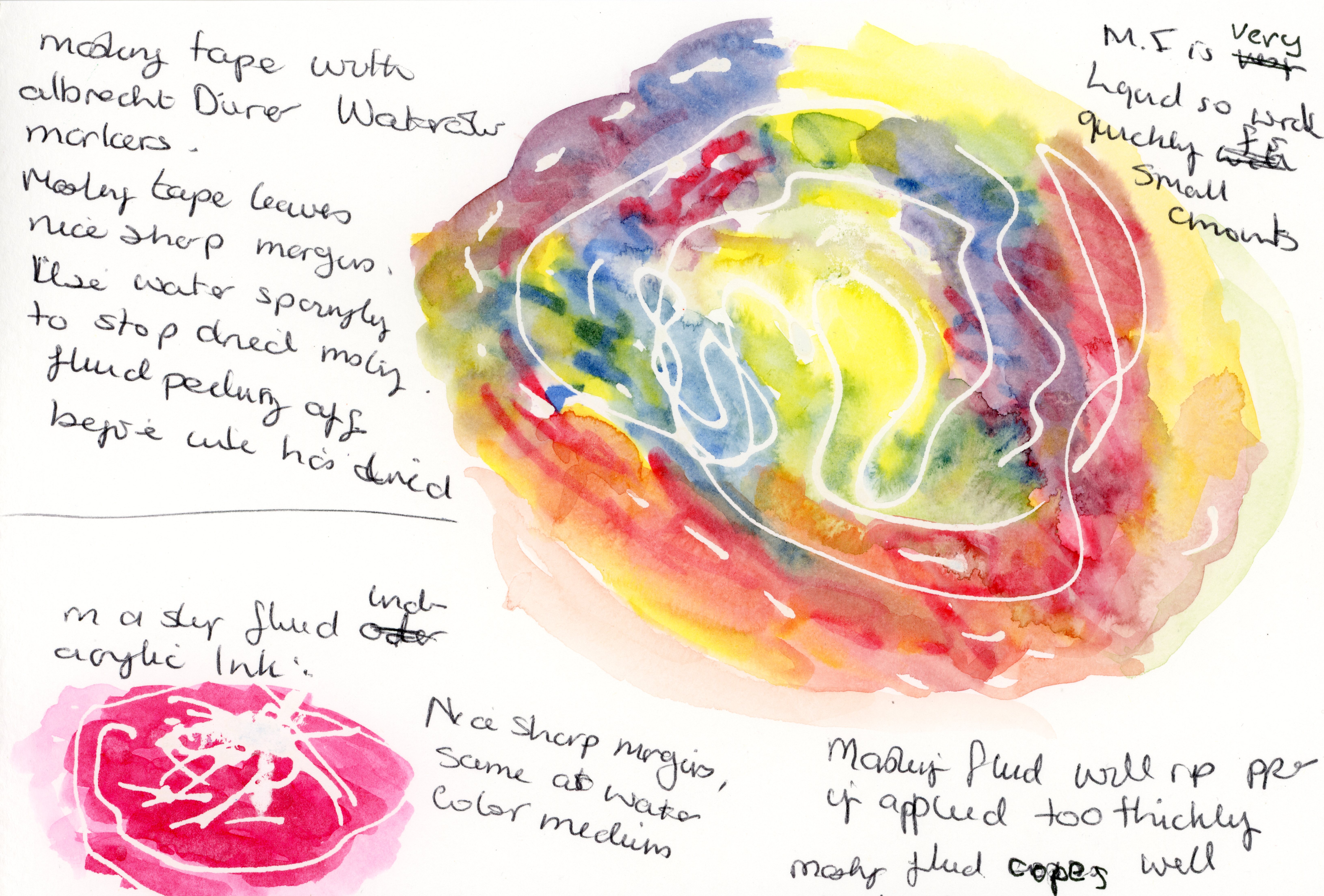
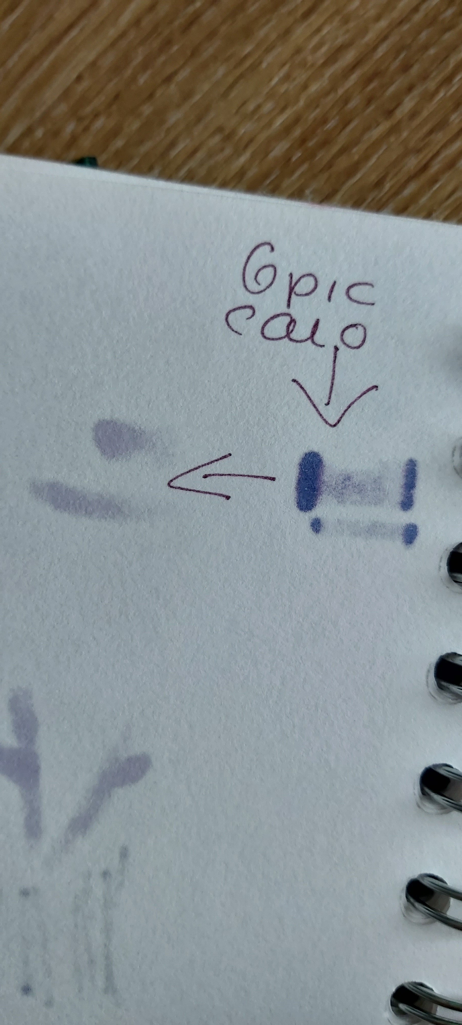
4. Performance when used in conjunction with masking fluid.
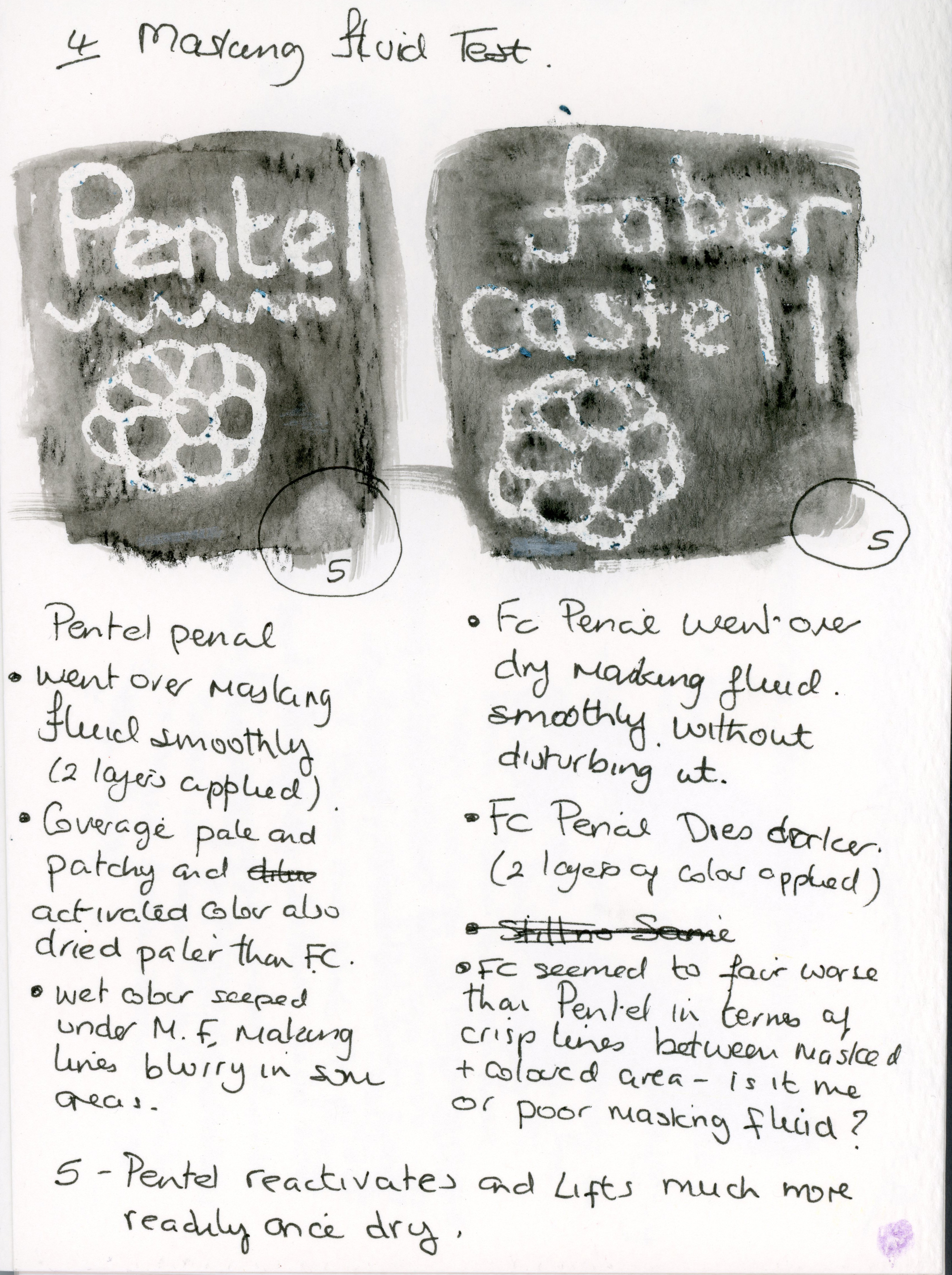
For this test, I used the same design in masking fluid, then once dry I applied two layers of watercolour pencil before activating with the watercolour brush, which allowed me to apply the same amount of water to each section.
Both pencils were easy to apply over dried masking fluid, with Albrecht Dűrer providing the most intense and even colour when activated.
The lines between masked and painted areas seemed cleaner with the Pentel pencils, but I am not sure if this is down to user error, as I’ve had this happen when I used this masking fluid in previous product reviews.
5. How easy is it to reactivate and lift colour once dry?
Whilst both pencils reactivated readily, the Pentel pencil lifted more easily, with Albrecht Dűrer showing good staining qualities.
6. How do Polychromos pencils perform over activated watercolour pencil once dry?
For this test, I selected Albrecht Dűrer pencils in Helioblue-Reddish and Ultramarine, Pentel colour 443 and 499. The Polychromos colours I chose were Ultramarine, Helioblue-Reddish, and White.

When I layered the Polychromos pencil over Albrecht Dűrer colours ‘Helioblue-Reddish’ and ‘Ultramarine’, the white pencil had the biggest affect on the Helioblue-Reddish, though it was still subtle.
What I found interesting was that the Helioblue-Reddish Polychromos Pencil looks warmer when placed over it’s own watercolour equivalent and cooler on the Ultramarine Albrecht Dűrer pencil.
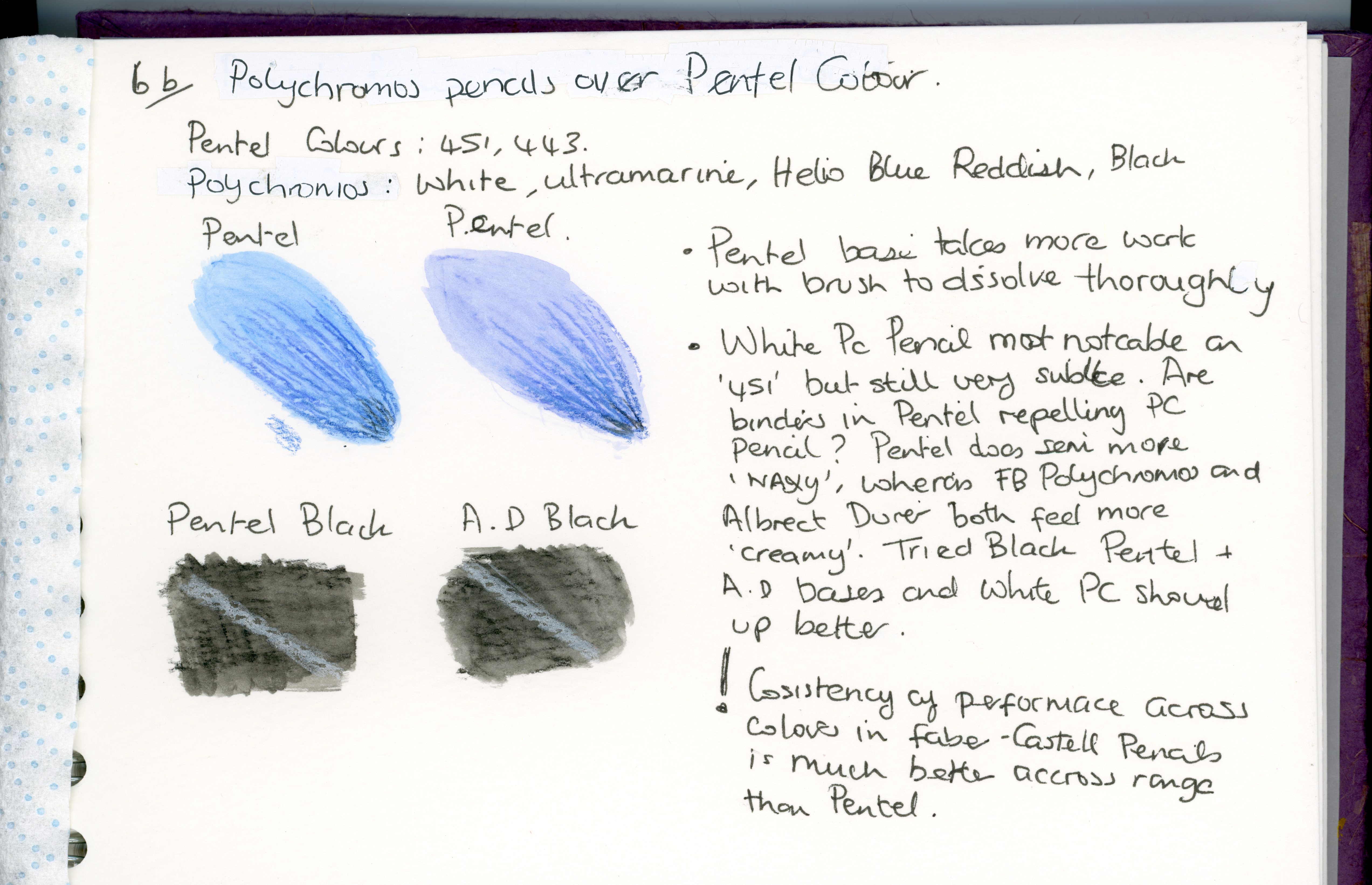
The white Polychromos pencil showed up best when used over the Pentel black watercolour pencil, though neither were particularly impressive.
When I was laying down the dry layers of watercolour pencil, I did notice that the Pentel colours felt more ‘waxy’ than Albrecht Dűrer, and I do wonder if there’s a higher wax content in cheaper watercolour pencils which tends to repel anything you try to put on top of it later.
My general feeling after conducting this test is that Faber-Castell pencils perform in a very uniform fashion across the whole range.
7. Comfort and ease of use.

My personal preference for barrel shape in pens and pencils is hexagonal or triangular, as I find this most comfortable and effective in staving off cramp, so the basic shape felt good on both pencils. However, the thicker barrel of the Albrecht Dűrer pencil was the more comfortable of the two, and I could use this for longer periods before my hand got tired and I needed a break.
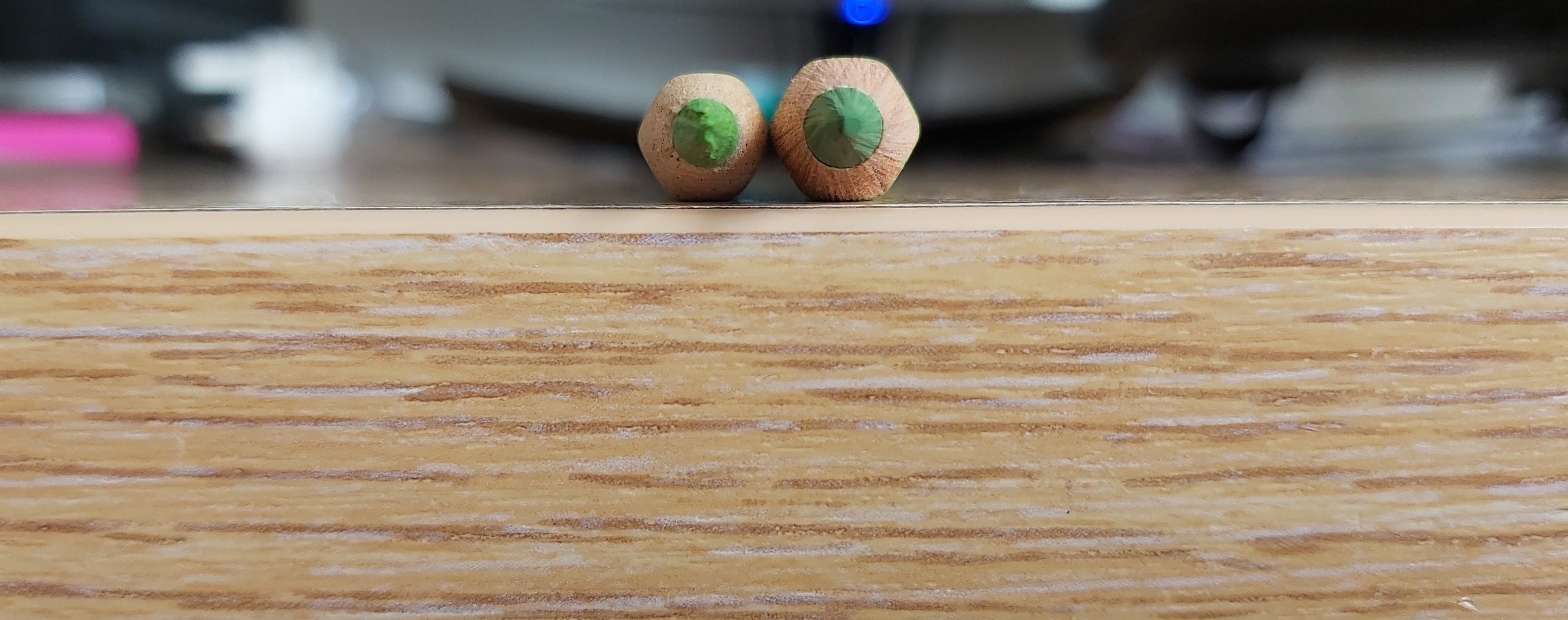
Pentel core (left) and Albrecht Dűrer (right) core.
I felt like the higher quality core of the Albrecht Dűrer pencil made for a more enjoyable experience as it took less effort to get good coverage and saturated pigment when activated.
The weight of the Albrecht Dűrer pencil, combined with the thicker core gave me extra confidence in mark-making as I wasn’t worried the point would break if I used more pressure, unlike the Pentel pencil which felt more delicate and as if it could only be pushed so far before it would break.
8. Are the pencils easy to sharpen? Do they break often?
For this test, I used the Faber-Castell 2001 Grip Trio Sharpening box.
Whilst it was easy to sharpen both pencils, I found that the Pentel Pencil broke more frequently despite being handled gently. I also noticed that the Pentel cores were already broken in a few places before I attempted to sharped them. Most of the Pentel cores were ‘off-center’ in the barrel, which may have contributed to their propensity to break.
10. Colour range.
Both sets have a nice range of colours. The Albrecht Dűrer set seemed to offer a more useful selection of warm browns, whereas the browns in the Pentel set all seemed to be more red-hued. The nearest colour to ‘Burnt Umber’ in the Pentel set also appeared to be more of a ‘mustard’ colour.
As for the greens, the Albrecht Dűrer set offered the better range, though I would have liked to see the Phthalo Green and Emerald – which I felt are too blueish – replaced with something like Permanent Green and Leaf Green to better compliment the Light Green and Earth Green Yellowish in this set. I’d even go so far as to ditch the white pencil completely and have 5 good natural, complimentary greens in the set instead.
I’d say the colour range of the Albrecht Dűrer set is more naturalistic, whereas the Pentel colours are pastel ‘candy’ colours which lend themselves to a very particular style of art.
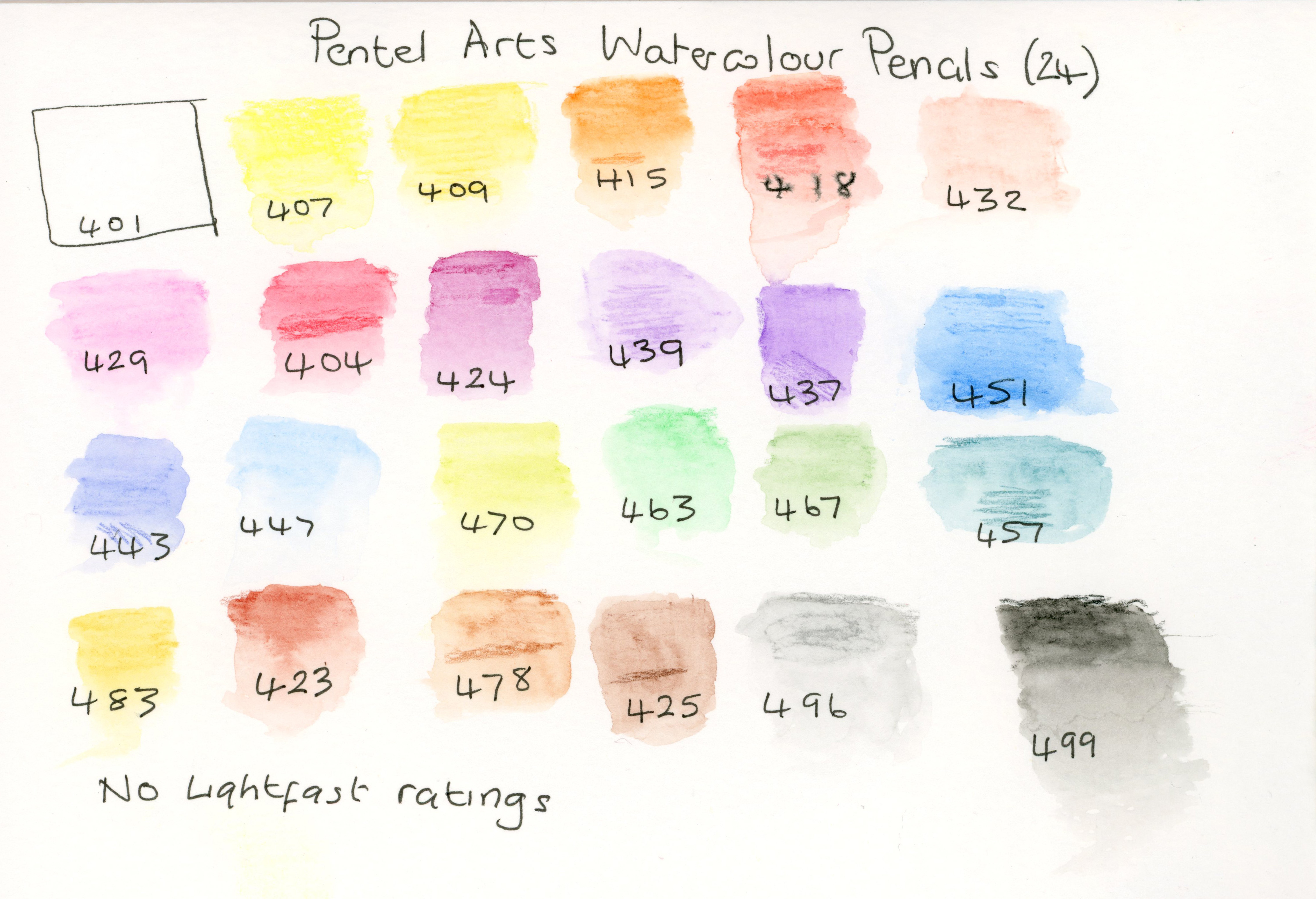
The Pentel set does not come with any information on light-fast ratings (which leads me to assume none of these pencils are light-fast), unlike Albrecht Dűrer which has light-fast ratings ranging from 2 stars (very good light-fastness for 25 years+) to 3 stars (100% light-fast for 100 years or more). 11 out of the 24 pencils in the Albrecht Dűrer set have a 3-star light-fast rating.
One thing that REALLY irritated me about both sets was the gold writing on the barrels which made the colour codes extremely hard to read, especially on the lighter colour pencils. To both companies, I would suggest a black band on the barrel with the colours written inside this band, as this would make them so much easier to read.
Conclusion.
Whilst the Pentel set is impressive for the price point, and more than adequate for a child’s school bag, if you’re looking for a decent range of saturated, usable colours that wont fade, I would not hesitate to pick the Albrecht Dűrer range.
The main advantage both the Albrecht Dűrer and Polychromos pencils have is that you can buy individual colours when each pencil runs out, whereas you’d have to buy a whole new set of Pentel Arts pencils if you ran out of one colour.
Another advantage of being able to buy individual colours is that you can try a colour you use very often – like green – before you invest in the whole set. You could even build your collection one pencil at a time if you had budget constraints.
I also feel it’s a good idea to start with a decent brand when you’re venturing into a new medium, as struggling to get decent results with a poor quality item – be it pencils, paints or whatever – could frustrate a beginner and lead them to abandon that medium altogether.
Ultimately, when deciding which of these sets is for you, I would say it’s a case of weighing up the importance of light-fastness and consistent quality against your budget. Would you be happy with a complete set of the cheap and cheerful Pentel pencils (bearing in mind the downsides discussed in this review) or would you rather assemble a quality set one pencil at a time?
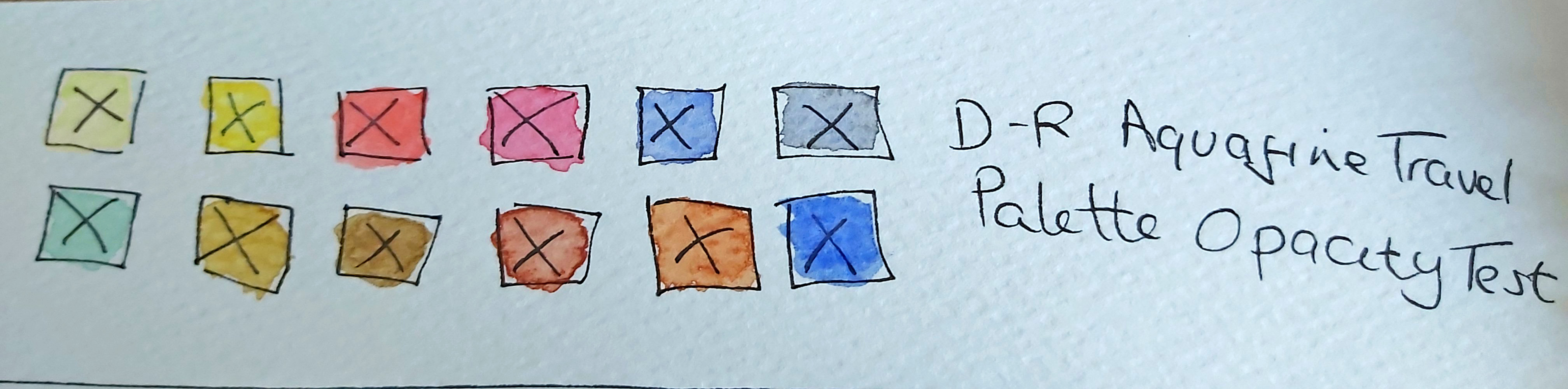
Review: Daler Rowney Aquafine Watercolour 12 Half Pans Travel Set, Assorted


PRICE: £14.40 from Jackson’s Art Supplies
TOOLS:
- Pink Pig Ameleie Textured Watercolour Sketchbook.
- Size 4 Short handle watercolour brush (included in palette).
- Cotman size 8 111 round watercolour brush.
- Sakura Pigma Micron Fineliner 0.5.
CRITERIA:
- Colour saturation/pigment.
- Mixing Primary colours.
- Wet-in-Wet.
- Transparency over Sakura Pigma Micron Fineliner.
- Glazing (mono and two colours).
- Flat Wash and Graded Wash.
- Colour saturation is initially quite impressive, even with weaker washes, though once dry, the saturation is less impressive and the paint takes on a chalky quality.

2. At first, I wrote this off as a failure, but in better light I realised I had mixed cool and warm colours incorrectly, resulting in muddy secondary colours.
However, when I repeated the test with Lemon Yellow and Ultramarine Blue, I was left with a nice fresh ‘spring’ green.


Lemon Yellow and Ultramarine produced a nice, fresh ‘spring’ green.
- Wet-in-Wet with one colour seems to spread well, but adding a second colour was less successful, with the two pigments ‘resisting’ eachother.
- Colours – once again – have a chalky appearance over Pigma Micron pen when dry – especially yellows and reds (which, surprisingly are rated by the manufacturer as ‘transparent’).
- This paint seems to lend itself well to glazing. The base layer does not seem to lift and the upper layer stays crisp at the edges.


- Flat wash seems consistent, but the gradual wash was a bit patchy, despite having the same water-to-paint ratio and completing the gradient in a single application.

Conclusion
This is a student grade set, which is evident by the chalky finish of the dry paint and my observation that the colours seem to lose the initially impressive saturation when dry.
When considering how the set functions for its intended purpose, i.e. ‘on the go’ I am left underwhelmed.
The main negative for me was the design of the case, as I feel more care could have been taken to ensure the over-filled paint pans didn’t stick to the lid, causing wastage and contamination of other colours (especially important saying as the consistency of these paints, even when dry is very ‘gummy’).
Another problem I found was that some pans do not clip into the grid securely.
The limited mixing surface was also an issue for me. It was possible to remove the grid and pans to get extra mixing surfaces, but this was a very fiddly process and somewhat defeated the whole object of a ‘travel kit’.
If you can live with the negatives I have outlined here, this would be an ideal purchase for an older child to take on holiday or a day trip (though I would recommend purchasing a separate full size brush rather than relying on the one in this set).
As long as you recognise the limitations of this product and don’t expect to create a masterpiece with it, you have a perfectly adequate, fun little kit.
Review: Pink Pig 4” x 4” Sketchbook
Pink Pig 4” x 4” Sketchbook
Website: the-pink-pink.co.uk
Paper: 150 gsm Cartridge paper
Paper Colour options: White, Off-white, Cappucino Brown
Cover Options: Covered back and Front, Covered front only, ‘Posh’ or ‘Classic’ (various colours – see website).
Price: SEE WEBSITE FOR CURRENT PRICES.
‘The Pink Pig’ is an independent, family-run British brand which has been in business since 1992. I first came across this brand when I was studying art at University, as their sketchbooks were sold in the campus art supplies shop. I have loved using them ever since, so when I ran out of the books I had bought during my Uni days, I was very eager to find the brand again (all I had to go on was search for ‘artist’s sketchbook, mulberry paper cover’ and the good old interwebs took me to the right place first time!).
Criteria
1. Coloured Pencil performance.
2. Generic pencil performance
3. Watercolour paints – overworking and warping
4. Watercolour Pencil – overworking and warping
5. Alcohol marker performance
6. Eraser performance
7. Watercolour brush pen performance
Tools
• Faber-Castell Polychromos Coloured Pencils
• Steadtler Noris Erasable Pencil
• Pentel and Faber-Castell Albrecht Durer Watercolour Pencils
• Mozart Watercolour Brush Pens
• Pilot Pintor Paint Pen
• Steadtler Lumocolor Marker
• Steadtler Metallic Marker
• Daler-Rowney Watercolour Paints
• Viviva Watercolour Sheets
• Copic Ciao Markers (Copic Ciao Doodle Pack)
• Generic Plastic Eraser
• Sakura Gelly Roll Glaze Pens
• Pentel Orenz Mechanical Pencil
1. Polychromos Pencils lay down very easily with a vibrant colour. Paper can take several layers of Polychromos pencil, but Steadtler Noris erasable pencil cannot be layered so easily and the colour is not vibrant. This paper definitely works better with good quality coloured pencils.


2. Standard pencils perform well, but I found the mechanical pencil performed best. Harder leads seem to leave an impression on the paper after being erased. Charcoal pencil hardly moves, so this is something to bear in mind, depending on what kind of effect you’re after.

3. Both Viviva Colorsheets and Daler-Rowney watercolour paints soaked into the page quickly (but did not bleed through), with limited ability to spread or reactivate the paint. The paper did start to bread down with very little water and brush work.

4. Pentel watercolour pencils didn’t spread well when water was added, but Albrecht Durer pencils performed well.
5. Pilot Pintor paint pens bled through slightly on the other side of the page, as did Steadtler Lumocolor and Steadtler Metallic Marker. Copic Ciao makers performed worst on this test, with the colour not only bleeding through to the back of the page I was working on, but also onto the next clean page. There was no bleed-through at all with Sakura Gelly Roll Glaze pens and they kept their ‘glaze’ after the ink dried.

6. Paper seems to cope well with even the cheaper eraser, and going over the same area multiple times did not damage the paper at all.
7. Watercolour brush pens lay down very nicely, with no bleed-through, even when several layers were applied. A single layer can be pushed quite far with water, but I found that darker colours tend to sink in quickly and can’t be blended or ‘extended’ with water as effectively. When blending colours, doing so directly from the pen produced better results than laying them down on paper first, before blending with a water brush. Layered colour reactivates quite well but a single layer of colour doesn’t.


Conclusion
The things I like most of all about this particular product are the choice of colours and finishes on the sketchbook cover, as well as the size of the sketchbook as you can pop several in a bag or coat pocket so that you always have something handy to sketch out an idea (I don’t know about you but my best ideas always pop at the least convenient moment!).
I also like the sustainability of this product – the company have strived to make as many elements of this product in recycled materials as possible. As a customer living in England I also like knowing my product has a smaller carbon footprint than say one of the bigger brand sketchbooks made abroad.
There’s really nothing I don’t like about this product, although the main suggestion I would give to improve this product would be to add the option of watercolour paper to this range of sketchbooks in order for artists to make the most of ‘Travel’ paint sets like the Daler Rowney and Viviva ones I used for this review, as well as watercolour pencils.
If this review has tempted you to try the product, I would really appreciate it if you used the affiliate link below, which earns me a small commission every time someone buys a product using this link. Thank you!
Review: Viviva Colorsheets – Single set.

RRP: £15.14 (https://vivivacolors.com/) Optional Vegan – Friendly Flip case and Water brush available (prices vary).
I received this set as part of my Scrawlrbox subscription.
TOOLS:
• Mozart Supplies 300gsm Cold Press Watercolour paper.
• Steadtler 0.1 Pigment Liner
• Winsor and Newton Cotman 111 #8 round brush.
• Winsor and Newton Cotman 999 16mm Mop Brush
• Motolow masking fluid pen.
Criteria:
• Colour Intensity/Pigment
• Mixing Colours (primary)
• Glazing (one and two colours)
• Wet in Wet (one and two colours
• Transparency
• Flat Wash
• Graduated Wash
• Masking Fluid
• Reactivation of dry paint and lifting wet paint
Colour intensity/pigment.
This paint is very highly pigmented, which can make it difficult to control the colour intensity, as unlike pans or tube paints, it can be difficult gauge how much water to add for a desired opacity.
Blues and reds seem hardest to predict in terms of how much water to add to control the intensity of colour.
Mixing Colours (Primary)
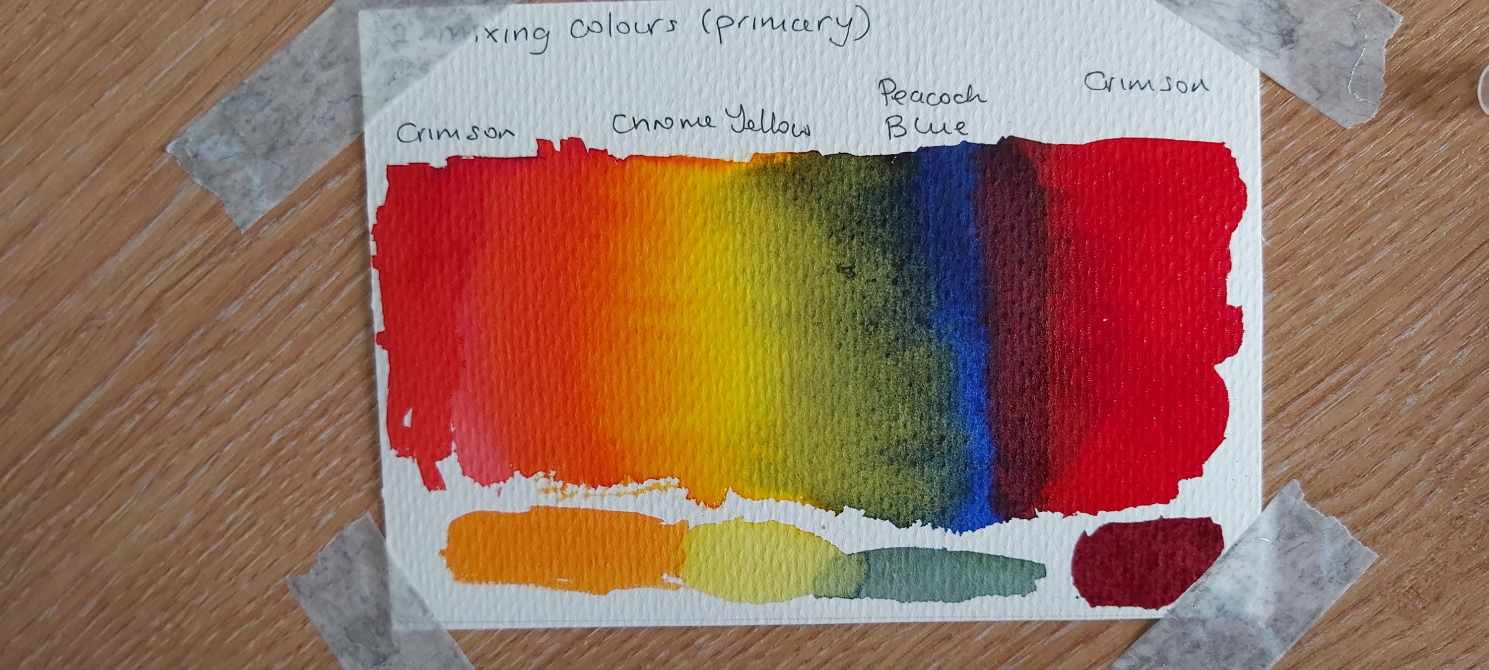

Mixing Crimson and Chrome Yellow gave a beautiful golden orange, slightly darker than the Chrome Yellow in the set.
Chrome Yellow and Peacock Blue created a dullish but still nice ‘teal’, whereas Peacock Blue and Crimson created a rich, deep aubergine colour, different to any of the purples in the set.
Crimson and Chrome Yellow on dry paper bled into each other nicely, giving an affect which reminded me of cirrus clouds.
Peacock Blue seems to bleed into both Chrome Yellow and Crimson with a more feathered effect. I found the patterns it created quite inspiring, reminding me of a distant tree line, which could be used to the artist’s advantage if they were painting a landscape.
Glazing – One and Two Colour
NOTE: 3 layers of paint – with drying time in between applications – were used for this test.
Nice transparency, but the base colour did lift quite easily with very little water. Same-colour glazing appears to work better than two colours as it gives deeper shades with a ‘clean’ colour, whereas the secondary colour in the two colour test tended to stay the same between the 2nd and 3rd layers.
The 2 colour glaze top coat dries with a definite, darker sharp outline.
Wet in Wet (one colour)
NOTE: Paper was dampened with a spray bottle.

Intense colour straight from the sheet doesn’t spread or ‘bloom’ as readily or as softly as Komorebi watercolours. Weaker dilutions tend to spread a little better but you lose the colour intensity, unlike Komorebi colours. However, this might make Viviva colours ideal for skies if you allow for the paint’s limited ability to flow.
Wet in Wet (two colour)
Note: Paper was dampened with mop brush.
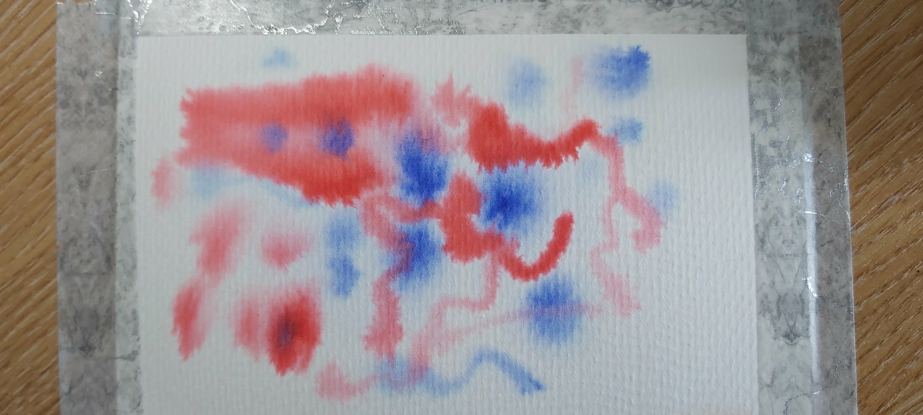
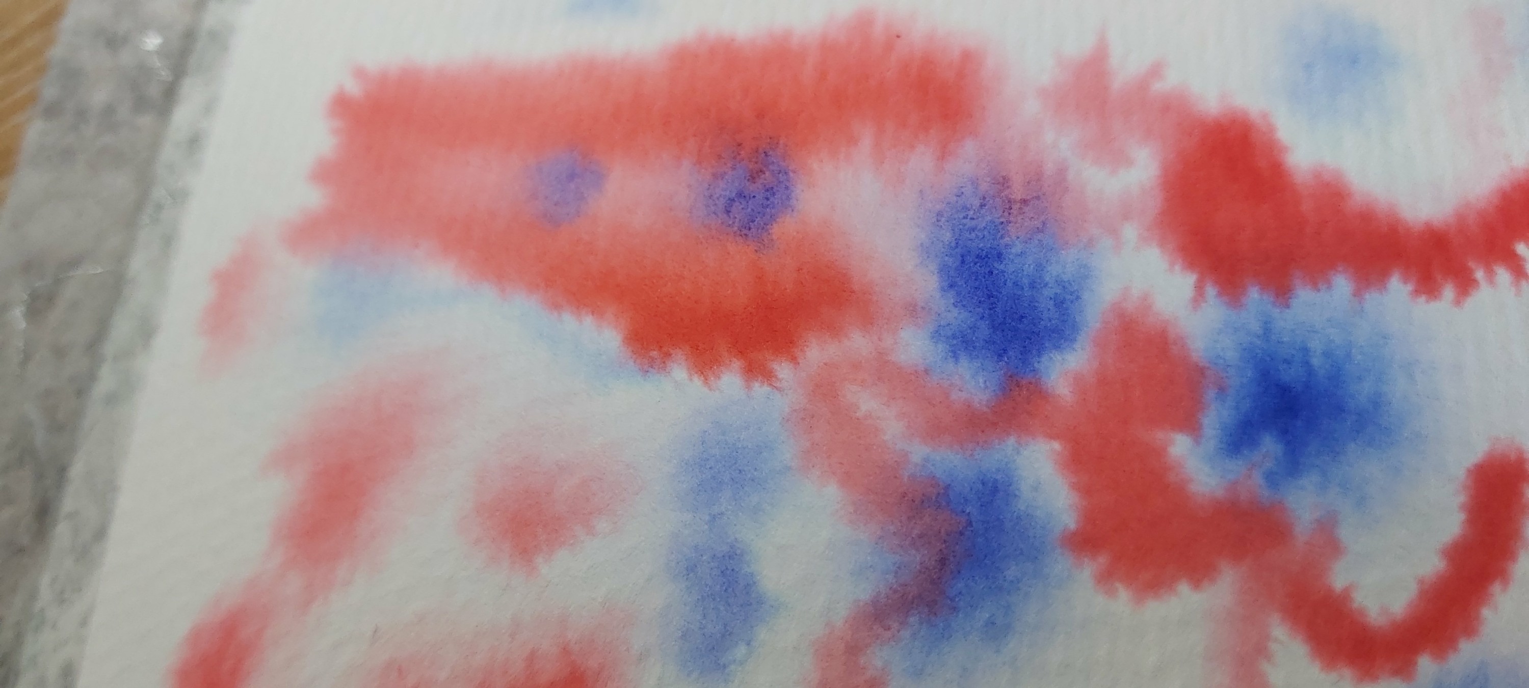
Interestingly, I found that the colours ‘bloom’ more readily when the paper is dampened with a mop brush, though the paint is still less ‘mobile’ than Komorebi watercolours.
When I dropped Peacock Blue into the wet Crimson, it almost seemed to repel the latter, and didn’t merge softly. This makes sense, considering way these two colours interacted during the ‘mixing’ test.
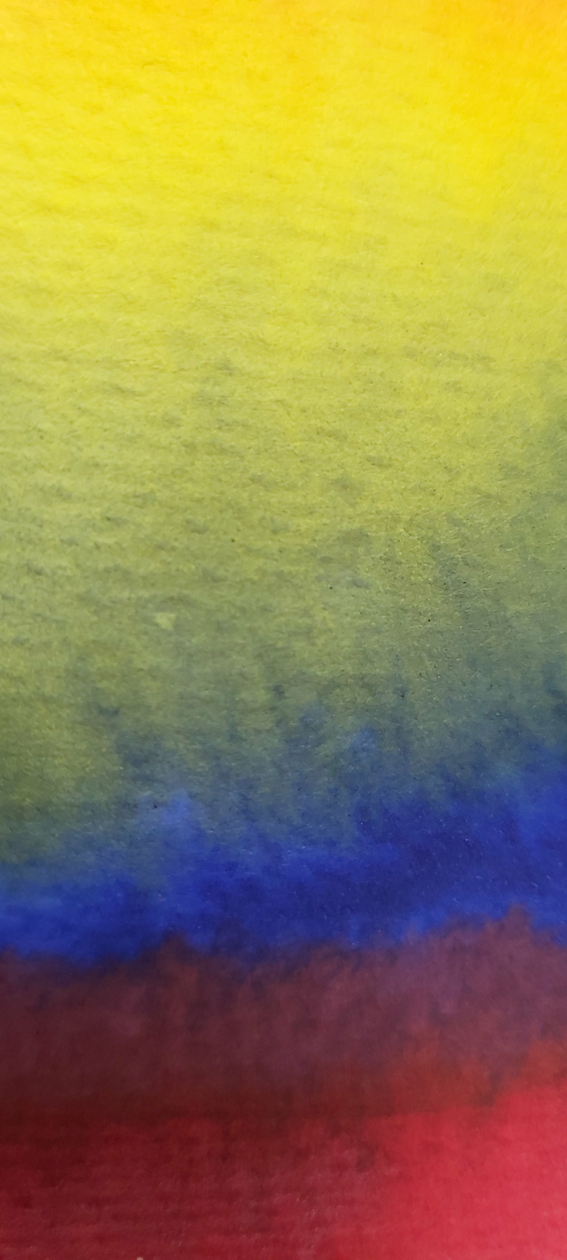
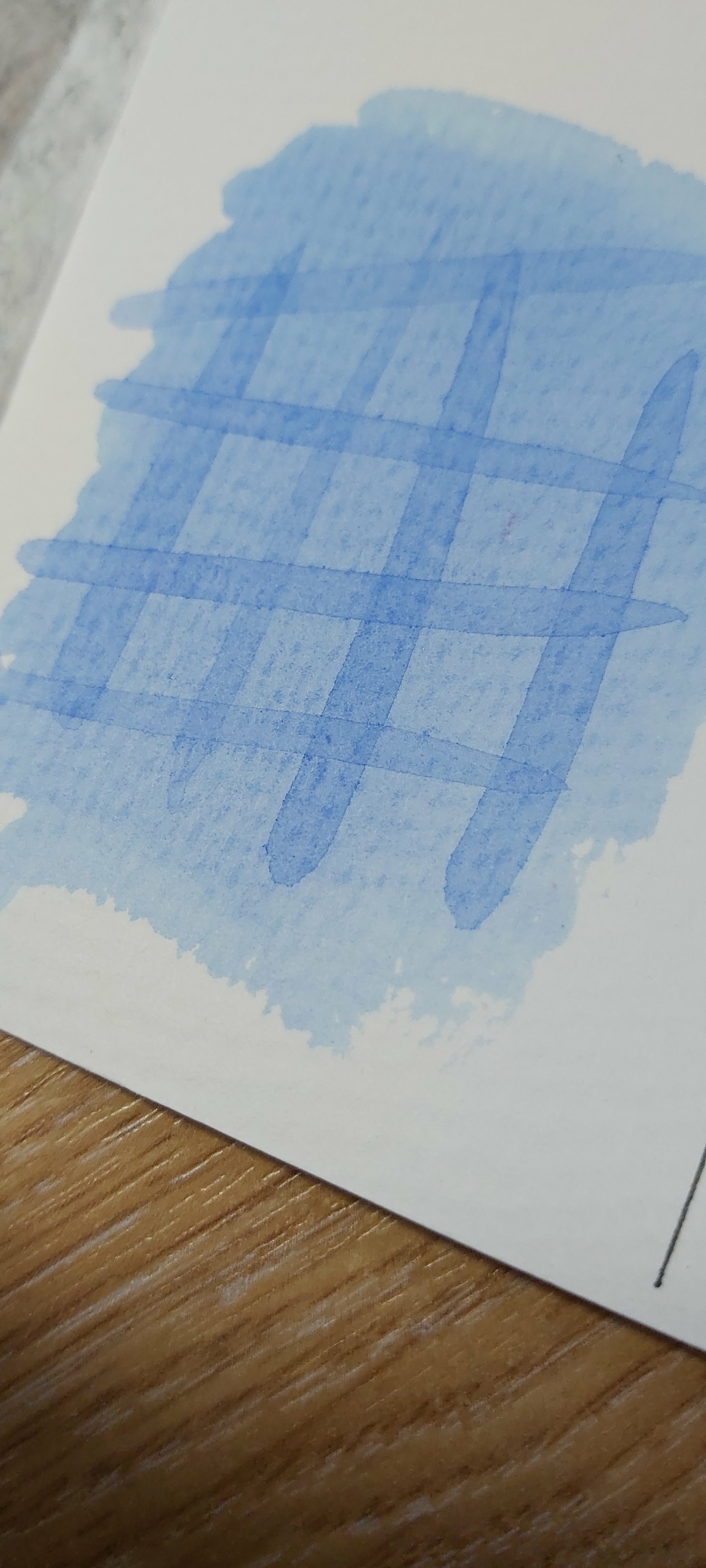
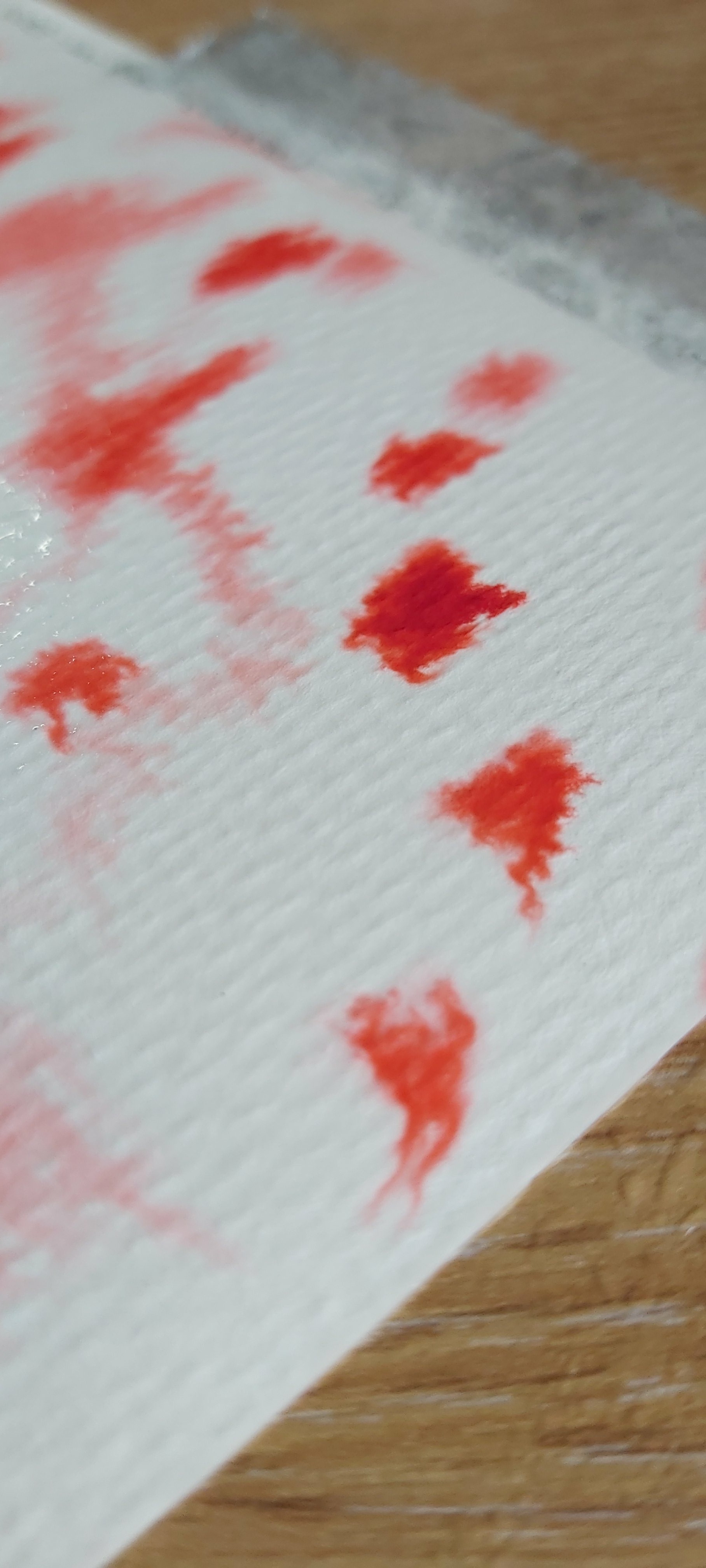
Transparency
![]()
![]()
For this test, I used the deepest saturation I could create in order to fully test the transparency of each colour.
As I suspected, blues and purples were the least transparent. Magenta was the most transparent in this group of colours.
Slate black gives a nice gradient and seems potentially useful for adding ‘mood’ to a foggy/twilight painting.
The colours were generally nice and clean over black pen, but the Chrome Yellow did leave behind and chalky residue.
![]()
Flat Wash
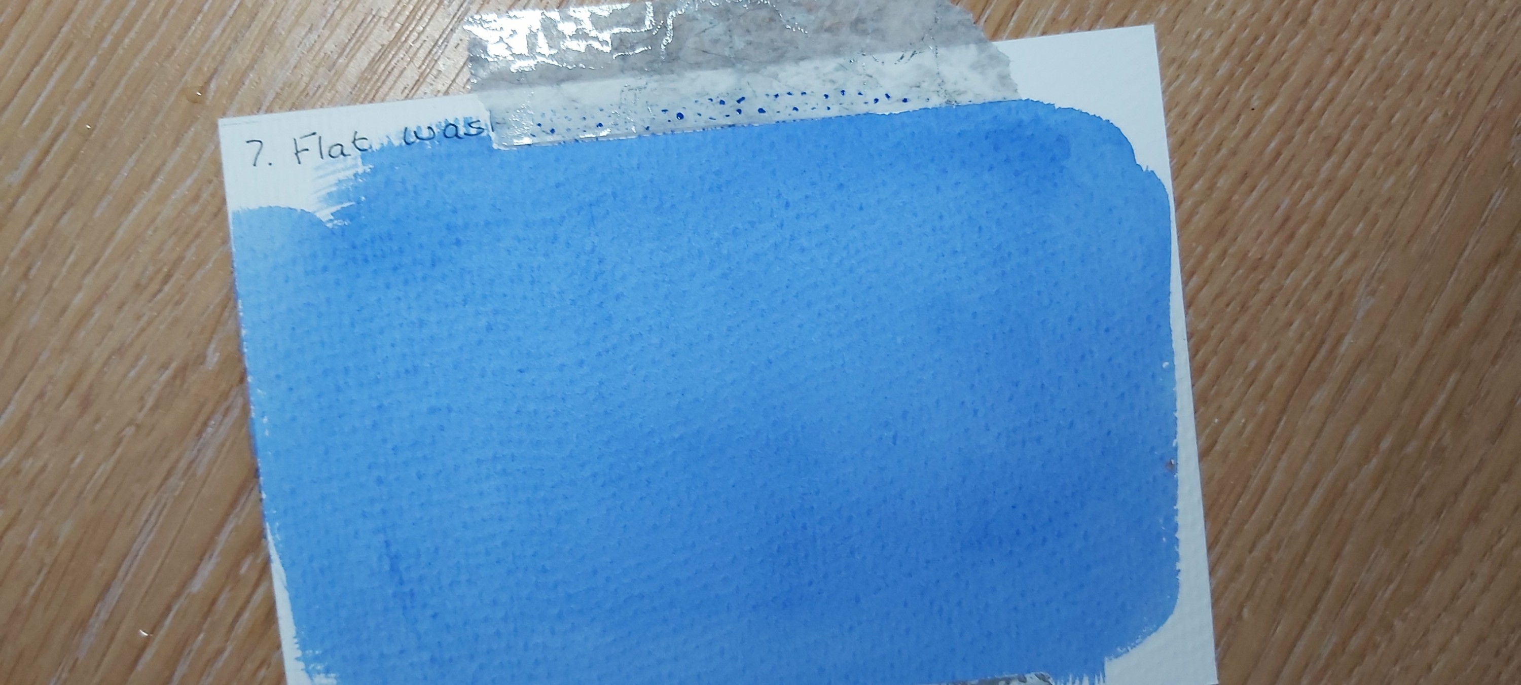
Because the composition of this product is more of a pigment dye than a conventional watercolour paint, washes are easy to apply, however you need to work quickly as the paper stains easily and can show a ‘tide mark’ where layers overlap.
Graduated wash

I was impressed with the softness and transparency of the graduation, due again to the composition of the pigment. Again, you need to work quickly because if you go over an area twice, it will show once the paint is dry.
Masking Fluid


Very crisp borders between painted and masked areas, giving an effect that reminded me of batik cloth. I think this was due to the pigments being more dye-like in composition.
Reactivation of dry paint and lifting of wet paint.
NOTE: Dry paint reactivated with round brush and wet paint was lifted with a paper towel.
Pinks and reds reactivated a little bit, but left a definite stain on the paper.
Oranges and Yellows did not behave consistently – Vermillion hardly budged, whereas Dusky Orange (now named ‘Flesh’ on the manufacturers website) reactivated significantly.
Violet hardly reactivated, whereas Magenta did so quite significantly.
Slate Black was the biggest surprise as it reactivated more easily than I expected.
This test was quite a challenge due to being unable to achieve a consistent dilution of the colours.
The lifting properties of the wet colours were very similar to the reactivation test.
Conclusion and final thoughts.
• Colours seem to dry as vividly as the wet paint, so need more dilution to achieve the tones you want in a finished piece.
• I’d like to see some more subtle greens in the range, as having to mix colours somewhat defeats the object of being able to create ‘on the go’. I would also like to see some cooler reds and the inclusion of a lemon yellow as the yellows and oranges in the set all seem to be more on the reddish/warm end of the spectrum.
• Crimson and Deep Pink are almost identical so I’d either try to formulate a different pink or leave one of these colours out in favour of more greens and a lemon yellow.
• Burnt Umber and Burnt Sienna are also very similar and I’d like to see a more ‘chocolate’ toned burnt umber.
• Pigment Papers lift quite easily from the booklet if they get wet, so maybe it would be better to make each page out of the palette paper rather than stick it to the pages of the booklet.
• Packaging could be improved with a closing tab to create more of an ‘envelope’ for those who want to protect their paints but don’t want to purchase the optional cover.
• If you’re not careful to make sure the paints are dry before closing the booklet, you can lose a lot of pigment on the greaseproof dividing sheets, which isn’t easy to pick up with your brush, so I see the potential for waste here.
• Surprisingly this pigment comes off plastic palettes with minimal staining.
• The colours will stain your ‘brush washing’ water very quickly so you’ll probably need fresh water more often if you’re using these paints at home.
Would I buy these paints for the RRP? Yes! When you consider this is a handmade product by an artist who designed them to meet a specific need, I think the concept is a good one and the pigments are very high quality for the RRP.
The key to enjoying this product is mastering how differently they behave to conventional watercolours and modifying your technique accordingly.
